“In a society of control,” Deleuze wrote, “the corporation has replaced the factory, and the corporation is a spirit, a gas.”1 This statement describes the immaterial nature of the notion of corporation, somehow denying its architectural roots, by depicting it as an entity in perpetual “metastability.”2 But if a corporation is defined by its immaterial flows, it is also described by the territorial basis of its nodes, legible in the headquarters of the corporation itself. Today, more than in the past, the network of intense online connection seems to have its fortified zones: IT campuses, research laboratories, and headquarters of the Internet giants appear as physical nodes for producing digital technologies and fostering global connectivity, but they also materialize as new strongholds of control and power. A kind of militarization makes these centers inaccessible and fortified garrisons, which paradoxically produces a spatial model that separates instead of connecting. Among the multinational technology companies, Apple is the pivotal example of a corporation serving a global marketplace while challenging, in the form of its headquarters, notions of virtual and physical space, connection and separation, centralization and colonization.
Design Meets Commercial Strategy: Jobs’s Leadership
From the early stage of Apple’s history, the idea of an autonomous, fully assembled, and complete machine was a key point for the company, which is still broadly recognized today for its very secure devices: fortified boxes, protected from viral attack. Apple is, indeed, one of the few IT companies in the world that seems to trust in its own autonomy, as a philosophy of labor, management, and marketing, and it is also the only company that has been rewarded by this philosophy. Under Steve Jobs’s leadership, a belief in the universal appeal of bare geometric forms and faith in software revolution, along with a strong entrepreneurial spirit, made the success of Apple Inc. The Jobs’s strategy was to design innovative and attractive products by simplifying and stripping down the Mac models.3 Every part of the process had to be carefully choreographed and designed, including the box, packaging, cables, and other accessories. In a conversation that took place in 1981, Jobs said that the Macintosh should be “like a Porsche,” evoking a futurist hymn on the machine’s power.4 Another interesting slice of the Apple strategy can be observed in Apple graphics and advertisements. Consider the spot “Think Different” (1997), directed by Ridley Scott for the Los Angeles office of advertising agency TBWA\Chiat\Day, which showed an overview of talented men who changed the history of humanity, like Picasso, Frank Lloyd Wright, Martin Luther King Jr., and Paul Rand. Following a now-familiar pattern of perfecting, overturning, or revolutionizing previous concepts, Apple paid homage to IBM, by modifying the slogan and trademark “THINK,” first used by Thomas J. Watson in 1911.5
Watching Jobs’s presentations of Apple products in the early 2000s, it is interesting to observe how frequently he used the word “architecture” when referring to the internal structure of his revolutionary products, located at the intersection of technology and design. While Apple has created an empire of autonomous and well-designed products, it has even extended its signature and its brand to its corporate buildings, which follow the corporate guidelines; in this way, the spaces, too, become Apple products. They seem to delineate a peculiar style—which we can name Apple Architecture—based on a self-conscious sense of design, minimalist geometric figures, and an apparent celebration of transparency, employed as a kind of advertisement or a form of propaganda.
Features of Apple Architecture
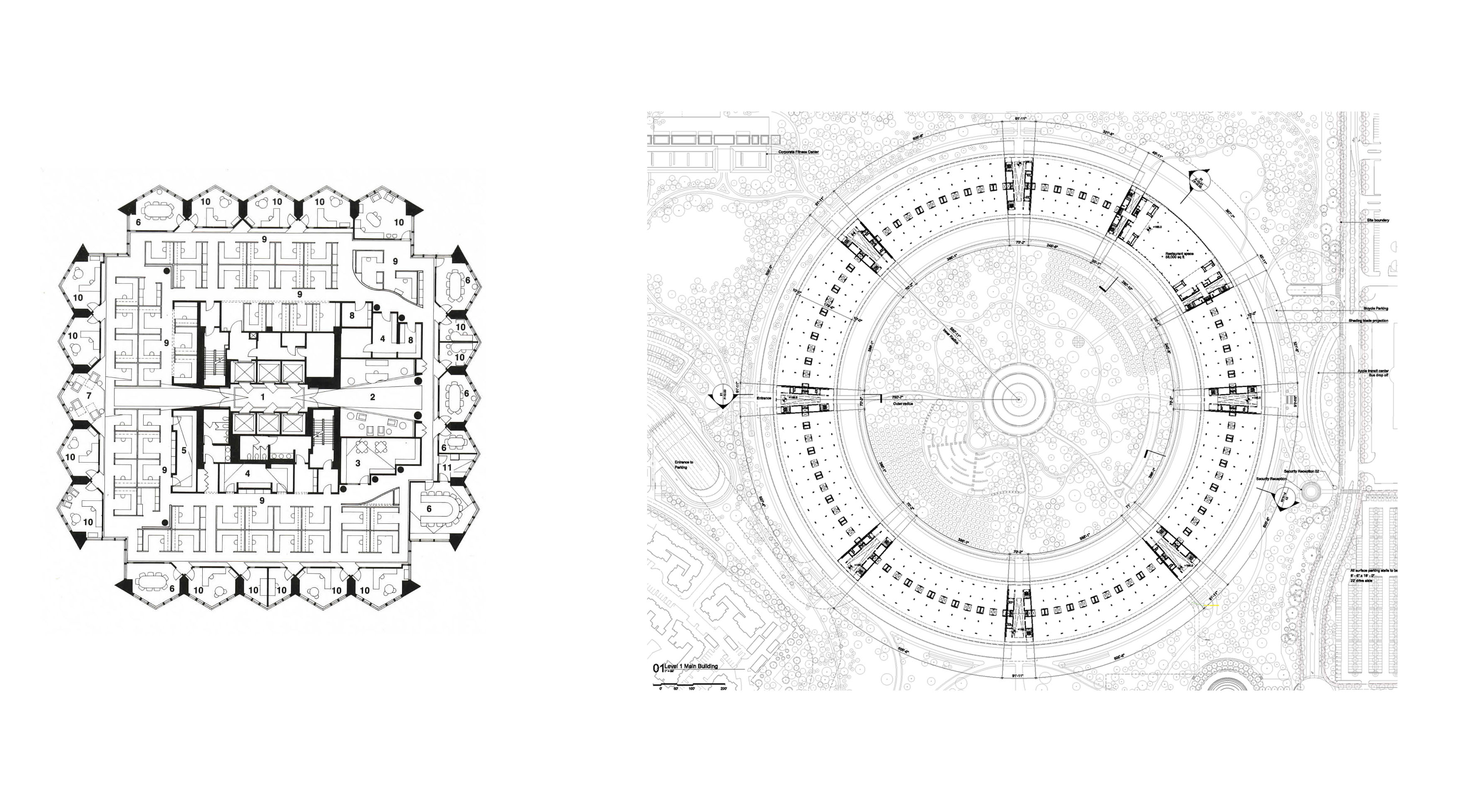
It might seem contrarian that in the era of global connection, which promises new horizons of democracy and freedom, the symbol of Apple is that of an exclusive and self-referential figure: the circle. The circle, which alludes to security, protection, and eventually, autonomy, is operative across Apple products, processor or building. When the spinning wheel is closed, the download is complete and the software is ready to be applied. The logo of an Apple device’s settings is a toothed gear; in order to gain access to the screen, one must press the central button, a circle. The circle is also the image of the plan for the Apple campus in Cupertino, California—both the older campus, known as “Infinite Loop,” which was designed by Hellmuth, Obata & Kassabaum in 1993, as well as the new campus, Apple Park, which was designed by Foster + Partners.
Evidently, the metaphor of the arena recalls the unrestricted global arena, which represents the exchange of information through digital infrastructures. Yet this figure also has certain political and economic implications. In fact, the Apple corporation embodies the idea of a new pragmatism, based on organizational efficiency in the struggle against competitors, control of information circulating on the Internet, and trading of this data through communication infrastructures. Therefore, if the geometry of the circle represents a universalistic idea of global connection, it also represents enclosure and self-sufficient centralization.
On June 7, 2011, during a city council meeting, Apple founder Steve Jobs personally presented the municipality of Cupertino with the design for the Apple Campus 2, intended to host twenty thousand people and designed as a sort of starship that had landed in Silicon Valley. The building looks like a futuristic spacecraft, a hyper-innovative machine meant to provoke destabilizing effects on its surroundings, according to Jobs’s words.6 This description identifies the building as a heterotopic space, like the ship described by Michel Foucault; a necessary, perhaps even a conceptual, space, full of creative energy and deployed in the enhancement of reality.7
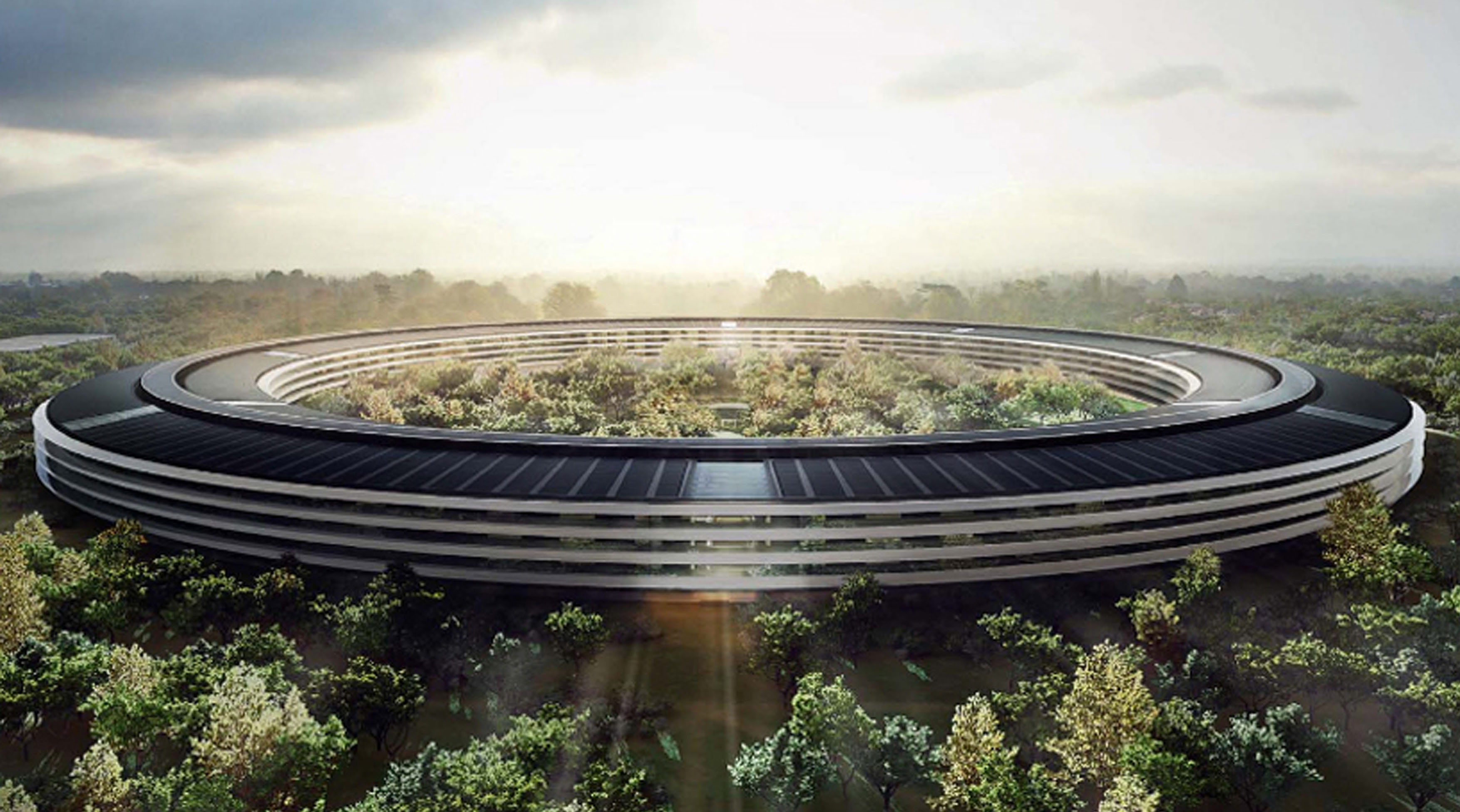
Norman Foster, who designed the campus with early input from Steve Jobs, seems to conceive it as a kind of high-tech, ring-shaped greenhouse, encompassing an hortus conclusus.8 According to Foster, Jobs’s first point of reference was Stanford University, designed by Frederick Law Olmsted around 1888. Stanford was both an architectural and urban model—it was conceived according to the tradition of the American campus as a utopian community, and it was inspired by the monastic precinct’s integration of labor and life. Its first design sketch showed a modest circular arrangement of buildings set in the hills to the south of the present Quad (1886), but the last proposal was a more formal composition, offering an ambitious design that was organized around two orthogonal axes (1888).9 What is really remarkable in the plan design is the link between the Inner Quad and the Outer Quad—a double ring of discrete buildings, connected by a complex system of arcades. From above, this interconnection of spaces makes the central quad akin to a castle, with its bulky stone walls (the campus’ pavilions) and its routes (the courtyards framed by pavilions). In some ways, the project became “urban architecture,” and this could be considered both the most important feature of the original Stanford architecture and the one most akin to Jobs’s vision: a circle as an experience of totality, like the interlinked quadrangles of the Stanford campus.
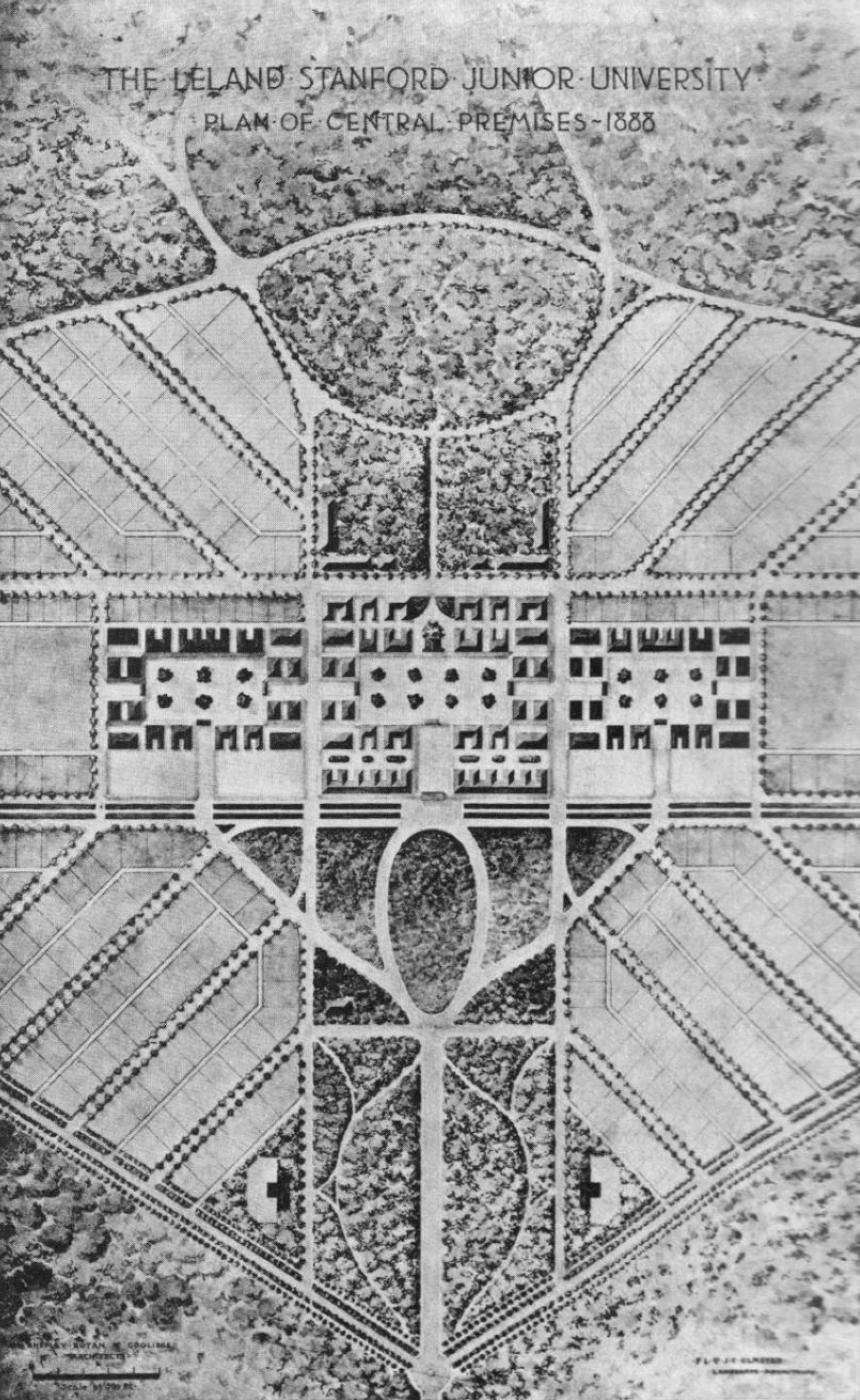
After a first idea to forest only the foothills south of the university, Leland Stanford expressed a more ambitious desire for a university and universal forest, an arboretum organized around different specimens of plants, encompassing the campus. As we will see, this proposal was superseded in the Foster–Jobs’s iteration by an inward-looking garden at the center of the Apple Park. Here, the forest that encircles architecture has been replaced by an hortus conclusus, in which a number of local plant species could be transplanted and protected in an asylum—a new kind of abbey of the digital age.10
We can trace the origins of this inward-looking space to two American corporate campuses, the Bell Telephone Laboratories at Holmdel, New Jersey (1962), designed by Eero Saarinen and Associates, and the Ford Foundation Headquarters in New York (1963–68) by Kevin Roche, John Dinkeloo, and Associates. The workspace at Bell Labs was entirely artificially conditioned; corridors lining the external curtain-wall encompassed laboratories and offices, as in the case of the ring of Apple Park. The most engaging point of comparison is found in the earliest sketches made by Saarinen, which can be viewed as a set of topological studies intended to investigate the relationship between inside and outside, contiguity and separation. Whereas the final proposal was arranged around a cruciform atrium, early models were distributed around an open, central space.11 Although the Bell Labs project as-built ultimately deviated from these initial sketches, the early proposal for a green atrium, equipped with tropical plants, is mirrored years later in the plan for Apple’s hortus conclusus.
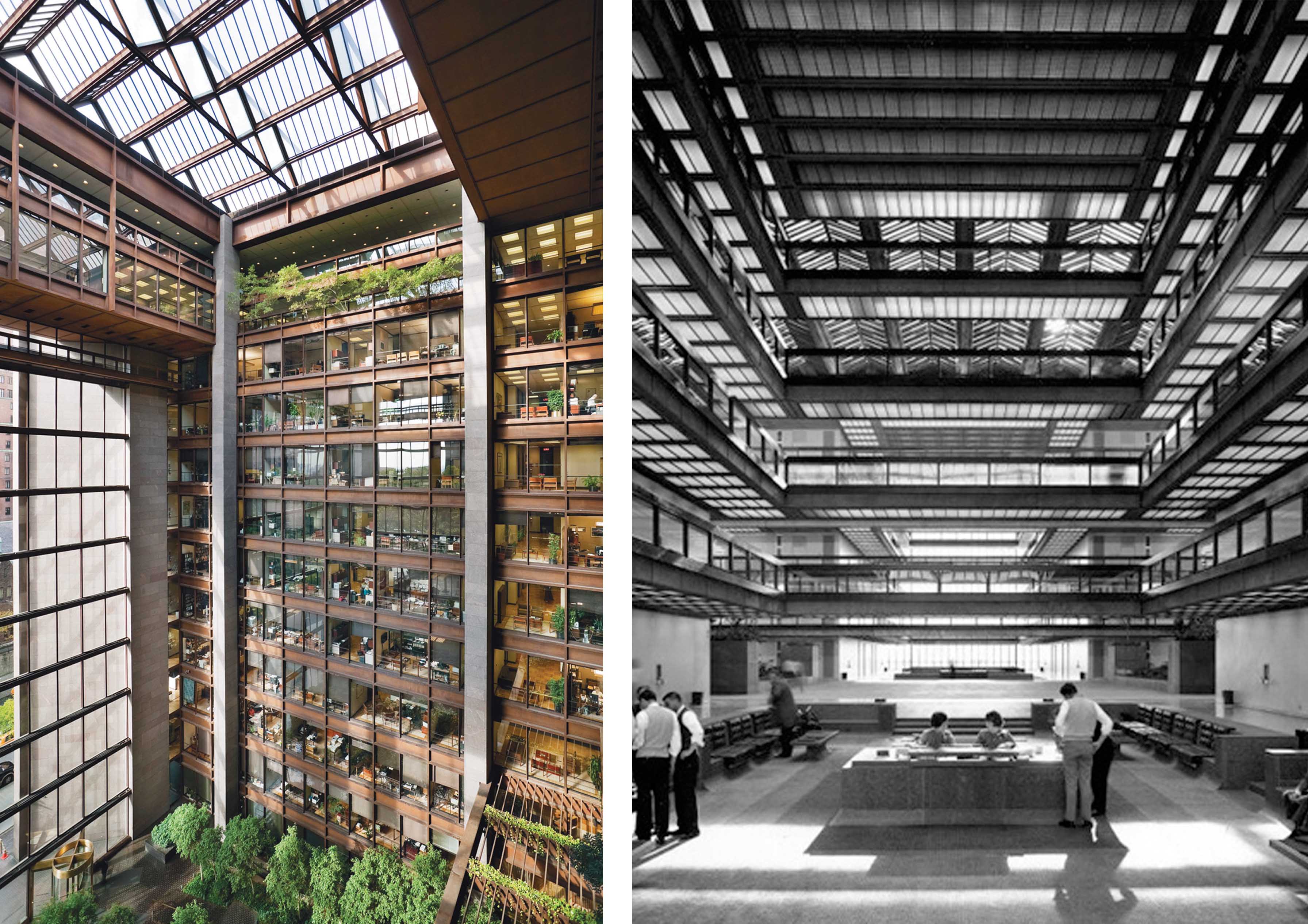
The Ford Foundation Headquarters also wraps its corporate architecture around a courtyard, disrupting the standard office floor typology by creating an unprecedented indoor garden arranged around an artificial and automatically controlled greenhouse. The goal, as Roche put it, was to articulate “a sense of the individual identifying with the aims and intentions of the group.”12 We may refer to the position of Kenneth Frampton, who depicted the exclusive Ford Foundation Building as “a house of Ivy League values and good intentions, dedicated to the dispensation of private profit for the public good, hermetically scaled in an unreal world.” 13 Tellingly, Apple’s hyper-tech, ring-shaped greenhouse demonstrates the same characteristics: it appears to be hermetic, scale-less, and utopian. It is made up of radial blocks for facilities, organized around eighty “pods” on each of the four floors that are intended as open workspaces with customizable seating; the restaurant is the only place that does not fit into the pod scheme.
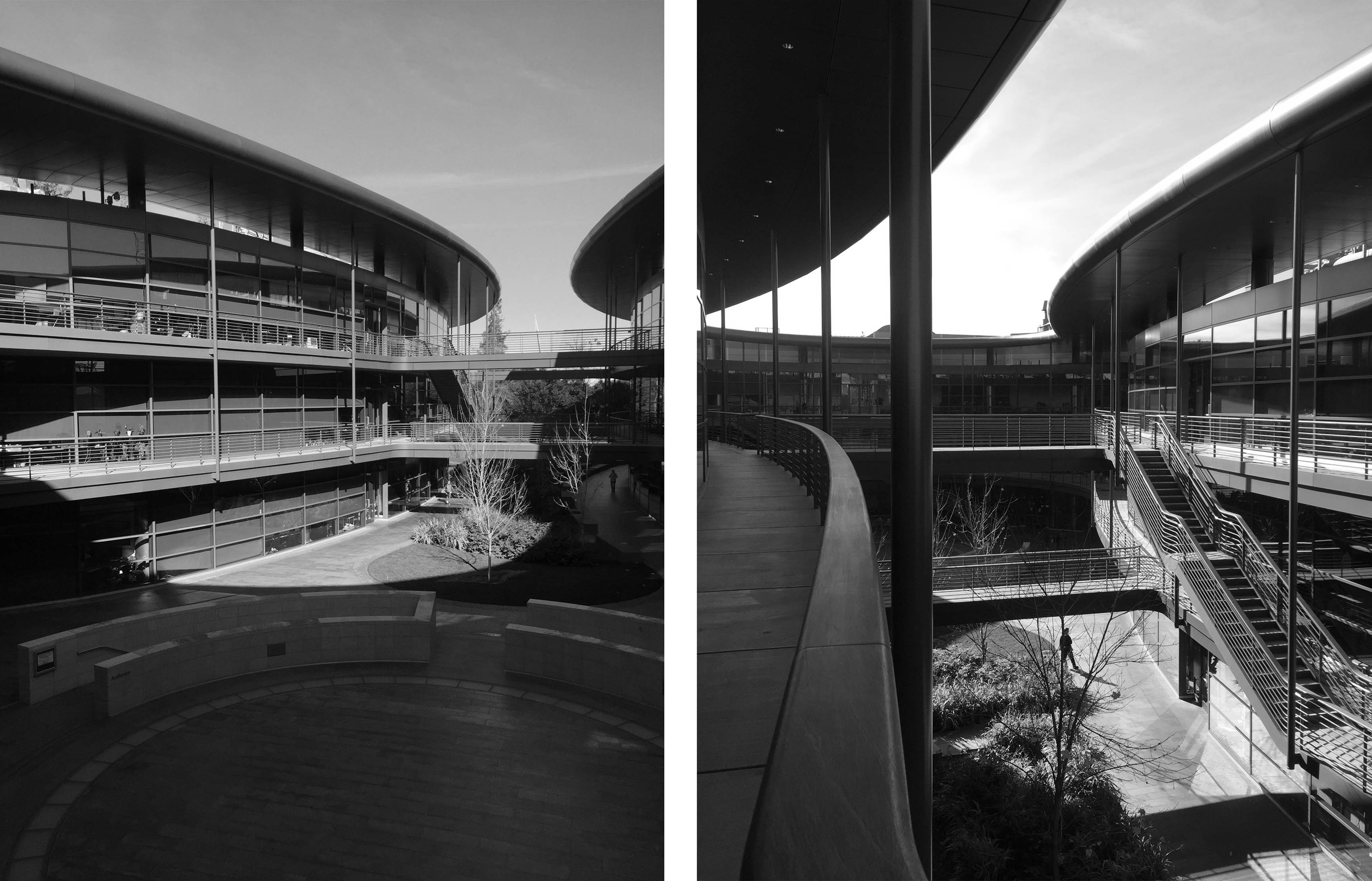
In some aspects, the Apple ring is comparable with another building, designed by Norman Foster as part of Stanford University: the James H. Clark Center for Biological Sciences. Intended to embody the collaborative spirit of interdisciplinary research, the Clark Center demonstrates the same Apple ring’s idea of a central void, onto which all of the building’s windows overlook. 14 Moreover, in the center of its open circular court, it houses two theaters where scientists can meet, share, and show their projects. The first of the two theaters is marked by a circle drawn on the ground while the second one, as in the Apple Park’s theater, is a meeting room underneath it.
From Panopticism to Colonization
The figure of the circle would seem to fit the ethos of particular places of worship and labor, precisely because it expresses the necessity of protecting the specific activity carried out inside from the outside. However, the circle contains as successfully as it incisively excludes. In this regard, my reference to Stanford University is not merely instrumental, for that campus reflects the greater tradition of the American campus as a city outside (or within) the city, like the University of Virginia in Charlottesville, designed by Thomas Jefferson in 1817. If the campus is a kind of miniaturized city, it is also in large part independent of the city itself. Evidently, the campus model cannot be perceived as a city’s fragment, inasmuch as it constitutes an alternative city—something introverted, exclusive, and recognizable.
Analogously to the Royal Saltworks of Chaux by Claude Nicolas Ledoux (1773–75), depicted as a spaceship grafted onto the city, the Apple Park ring neglects the territory on which it seems to have temporarily landed, despite its deep foundations. Ledoux usually put his designs in abrupt contact with the landscape: the cubes and spheres that featured in his L’Architecture are clearly artificial objects, their artificiality referring to a purified expression of nature. However, in Ledoux’s lexicon, architecture dominated and surveyed the countryside, in keeping with the model of the belvedere, whereas the Apple ring is a blind element of surveillance.
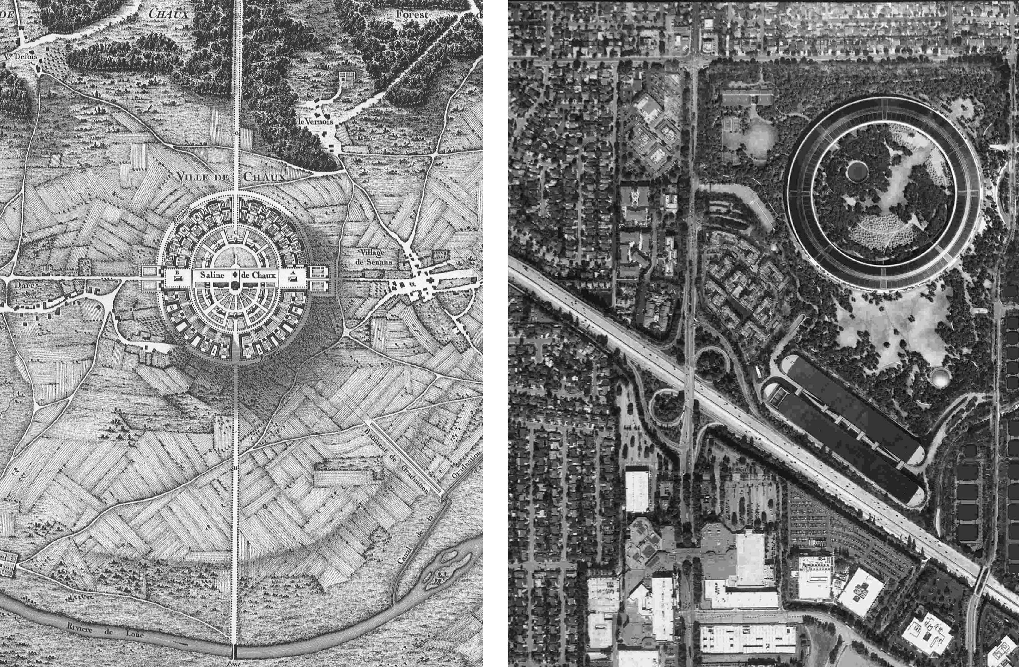
Urban design is not the only point of contact between Ledoux’s and Apple’s product. An abstract principle of autonomy could be seen as a trait d’union between the two, and this refers not only to the unity of design but also to the type of labor carried out in these spaces. In his essay on “Revolutionary Design,” Antoine Picon states that Ledoux proposed the rationalization of production by means of a rigorous spatialization, and that “the idea of surveillance, which was facilitated by the elliptical emphasis, played a crucial role, the gaze of the director being directed in turn at the various stages of the production.”15 But this surveillance, writes Picon, would have proved wholly ineffectual if there had been no consensus between workers and director. Thus, if the ellipse—or rather, the circle—is a form of surveillance, it could also be considered the form of the social contract: “the factory and its environs were the framework for a perfectly adjusted social representation; the ellipse and the circle also referred to the notion of a community that was transparent.”16 The same transparency was invoked by Jobs, who has stated that he designed the campus as an amphitheater, which should be a symbol for sociability.17 Although Apple Park hosts a different kind of community of production—a community made up of immaterial workers—it shares certain similarities with the Royal Saltworks of Chaux.18 But if the second project for the Saltworks—an ellipse-shaped figure—was morphologically akin to the Apple ring, then the first one—a building shaped like a castle—reveals a deeper typological analogy still. Here, all of the factory facilities were arranged in a continuous quadrangular body, creating, according to Antony Vidler, a “type form” that unified all of the community’s needs within a unique diagram—just like Apple’s circle.19
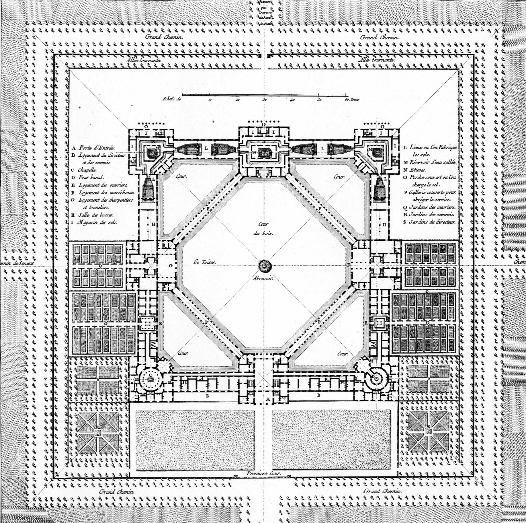
Like Ledoux’s design, the Apple strategy is founded on centralization as corollary to colonization. In fact, while Ledoux designed a network of habitations and services that represented an intention to systematically exploit the surrounding territory, the Apple company uses Apple stores as “sentinels” of consumer taste, interspersed within the nodes of the global market. The prototype residences and workshops located in the Chaux forest, at the intersection of pedestrian paths, designed by Ledoux, appear to parallel the notion of colonization that Apple deploys through the architecture of its stores. Indeed, the aim of Ledoux’s fabriques was not only to reaffirm the factory’s domain within the countryside but also to reform the habits of this region’s “rude men.” In the same way, Apple attempts to convert consumers to the Apple way of thinking through both its physical presence in the city and through virtual means of visual and psychological persuasion. (Consider the directive in Apple’s advertising slogan, “Think different.”)
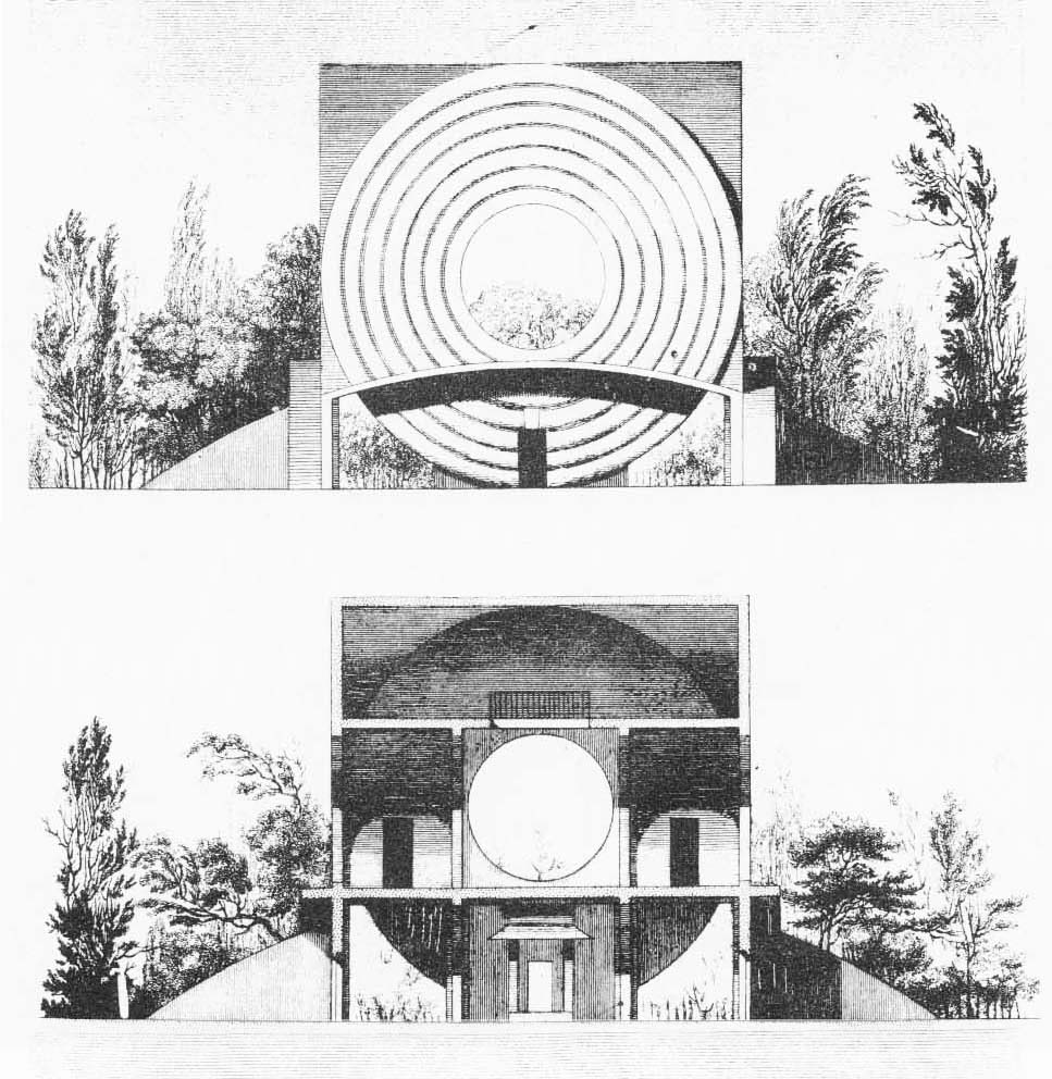
It seems possible, albeit provocative, to make a formal comparison between the Ledoux pavilions and the Apple stores. Ledoux designed each residence as a type of community place, around a main, two-story-high space, with ovens for heating and cooking at its center. The Apple store prototype, whose center is occupied by particular furniture-like elements in order to exhibit computers, could be seen as a similar space. One of these furniture elements, the Genius Bar, appears to be borrowed from the concierge desk of the Four Seasons Hotel, which was found to be the best service experience by the Apple employees tasked with testing and reinventing the retail store concept in the twenty-first century.20 In Ledoux’s house of the forest watchman—an open cage where the walls are replaced by square pillars—nothing obstructs the view of this rural panopticon. This visual permeability could be seen as closely tied to the total transparency of the Apple store. But in the latter, we find a kind of inverse control—what counts here is the possibility of looking inside.
In any case, although a purely behavioral analogy between Ledoux’s Saltworks and Foster’s Apple Park seems plausible, a structural comparison is almost unsustainable. In the latter project, an abstract circle simplifies the typology of the amphitheater, a reference that likely recalls the arena in Oakland where Steve Jobs enjoyed attending concerts, rather than the Roman archetype.21 The entrance of the building has lost its architectural role, remaining only as a transitional space, eventually determined by systems of surveillance. No architectural devices are deployed, nor is there any contrast between light and shadow; finally, a kind of coldness without tension runs through the corridors and into the workspaces. We are in a kind of mechanistic space, a place where architectural structures can be placed on the ground without any particular regard for weight and measures, where buildings can be equally transparent on both sides, where architecture expresses the frictionless flow of money, and where geometry itself can be operationalized as a brand.
Utopian City or Gilded Cage?
Evidently, the fact that Apple counts nineteen thousand employees in its new Cupertino location and 110,000 in the rest of the world demonstrates that the campus in the digital era is not just the technological citadel of the business community, all concentrated in a single place, but rather a collage of fragments placed along various international circuits.22 Nevertheless, with the new campus, Apple emphasizes the company’s need to broadcast its presence in the worldwide economy through the physical certainty of a monument to lasting architecture. Corporate culture’s need for “supertechnological monuments” (as Manfredo Tafuri described this kind of building in 1970) seems to be alive yet and, again, this position demonstrates that a company’s physical location still transmits the appearance of power.23 This is why Apple’s most enduring symbol is probably no longer the apple on its products but rather the iconic circle of its campus in Silicon Valley.24
To some extent, Apple Park will overturn what Reyner Banham called “Silicon Style,” referring to the kind of informal Google architecture that characterized the thirty-mile spin of the Santa Clara Valley from South San Francisco to San Jose.25 Now that the spaceship is landing, this region is going to be interrupted by something other than what local hackers call “serious play.”26 Far from Deleuze’s dematerialized predictions, an object is arising, no longer arranged according to informal, temporary, and flexible patterns but rather according to specialized, secured, and hierarchical spaces, clear and controlled flows.
-
Gilles Deleuze, “Postscript on the Societies of Control,” October 59 (Winter 1992): 4. ↩
-
In electronics, the condition of “metastability” identifies the skills of a digital electronics system to persist for an unlimited time in a state of precarious equilibrium. See Anton Bovier, Frank den Hollander, Metastability: A Potential-Theoretic Approach, (Berlin: Springer, 2015). ↩
-
Jonathan Rotenberg, “Personal Computing 1984: PC Pragmatists, Macintosh Visionaries and the Future of Portability,” Computer History Museum, November 2, 2016, link. ↩
-
See David A. Price, The Pixar Touch: The Making of a Company (New York: Alfred A. Knopf, 2008): 83–85. ↩
-
See “THINK” signs in “An Empire Built on Punched Cards,” Computer History Museum, link. ↩
-
“Steve Jobs Presents to the Cupertino City Council,” YouTube, June 7, 2011, link. ↩
-
See Michel Foucault, “Of Other Spaces: Utopias and Heterotopias,” Architecture/Mouvement/Continuité, no. 5 (October 1984): 49. ↩
-
See Cathleen McGuigan, “Asking Mr. Big,” Architectural Record, no. 3 (March 2014): 72–74; Foster + Partners, “Apple Campus 2,” in Domus, no. 985 (December 2014): 28–31. ↩
-
See Richard Joncas, David J. Neuman, and Paul V. Turner, Stanford University (New York: Princeton Architectural Press, 1999), 2–12. ↩
-
The inward-looking garden refers again to the Foucauldian heterotopias: it seems to be a profane version of a holy space, continuous as a ring but disconnected from context, in a spiritual detachment, as a condition for intellectual, scientific, and artistic autonomy. In the third principle of his essay “Of Other Spaces,” Foucault described the garden as (a place where) “all the vegetation was supposed to come together, in a sort of microcosm.” See Foucault, “Of Other Spaces: Utopias and Heterotopias,” 49. ↩
-
See Reinhold Martin, The Organizational Complex: Architecture, Media, and Corporate Space (Cambridge, MA: The MIT Press, 2003), 193–197. ↩
-
See Felicity Scott, “Instruments of Environmental Control,” in Outlaw Territories (Cambridge, MA: The MIT Press, 2016), 52. ↩
-
Kenneth Frampton, “A House of Ivy League Values,” Architectural Design (July 1968): 305–11. ↩
-
The Clark Center opened in 2003, and it was designed by Foster + Partners in collaboration with MBT Architecture. ↩
-
Antoine Picon, French Architects and Engineers in the Age of Enlightenment (Cambridge, UK: Cambridge University Press, 1992), 280–281. ↩
-
Antoine Picon, French Architects and Engineers in the Age of Enlightenment. ↩
-
See Walter Isaacson, Steve Jobs (New York: Simon & Schuster, 2011). Consider also the presence of the Shoreline Amphiteater in the Silicon Valley area, described by Reyner Banham. See Reyner Banham, “La Fine Della Silicon Valley,” Casabella 539 (1987): 42–43. ↩
-
For the definition of immaterial worker, see Maurizio Lazzarato, “Immaterial Labor,” in Radical Thought in Italy: a Potential Politics, eds. Paolo Virno and Michael Hardt (Minneapolis: University of Minnesota Press, 1996), 132–141. ↩
-
See Antony Vidler, The Scenes of the Street and Other Essays (New York: The Monacelli Press, 2011), 152–161. ↩
-
These experiments took place in a warehouse rented by Apple near the campus in Cupertino, where the first prototype was built in 2001. See Jason D. O’Grady, Apple Inc.: Corporations that Changed the World (Westport, CT: Greenwood, 2009), 53–54. ↩
-
See Walter Isaacson, Steve Jobs (New York: Simon & Schuster, 2011), 368–76. ↩
-
See Rosie Downey, “Technology Employers in Silicon Valley, Ranked by Local Employee Headcount,” Silicon Valley Business Journal, June 3, 2016. ↩
-
Manfredo Tafuri and Francesco Dal Co, Architettura Contemporanea (Milano: Electa Editrice, 1979), 103; Manfredo Tafuri, “Lavoro Intellettuale e Sviluppo Capitalistico,” Contropiano 2 (1970): 241–281. ↩
-
Consider the impact of the dystopian novel by Dave Eggers, The Circle (San Francisco: McSweeney’s, 2013). ↩
-
See Reyner Banham, “Silicon Style,” Architectural Review, no. 169 (May 1981): 283–90. ↩
-
See Gwendolyn Wright, “The Virtual Architecture of Silicon Valley,” the Journal of Architectural Education, vol. 54, no. 2 (November 2000): 88–94; Cathy Lang Ho, “Silicon Valley,” Metropolis, October 1995, 88, 70–72. ↩
Lina Malfona is an architect with a PhD in architectural theory and design. She helped found the architectural firm Malfona Petrini Architetti in Rome, where she works as adjunct professor at Sapienza. Her built work and writings have been published through Il Poligrafo, Gangemi, Quodlibet, and in The Plan, Anfione e Zeto, Paesaggio Urbano, Rassegna Architettura e Urbanistica, and Ananke. Thanks to a Fulbright grant, she is pursuing her latest research project on Silicon Valley’s architecture, working as a visiting researcher at the IFA, New York University.

