“Harry is a picaresque character and a very special guy,” said Rafael Viñoly.... “He’s very emotional and completely honest about his passions. He’s basically a truck driver with an education in aesthetics.”1
“Harry thinks this building is the most important building in the history of architecture.”2
New York’s 432 Park Avenue elicits strong reactions—including from Harry Macklowe, one of its main developers, and Rafael Viñoly, principal of the firm serving as design architect.3 In this October 2013 description of Macklowe, with its sarcastic mix of disdain and satisfaction, Viñoly not only sketches out some of his own behind-the-scenes perspective, he also anticipates the embarrassed whisper I’ve heard from many architects when asked about this building over the past few weeks: “I actually really like it.”
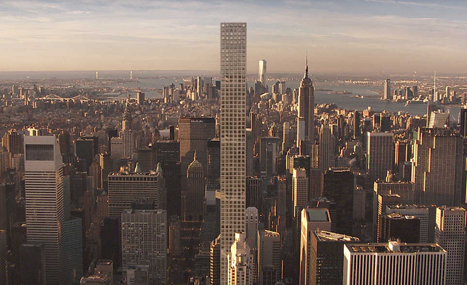
432 Park is not the most important building in the history of architecture, and Viñoly knows it. As it has been generally portrayed—accurately—this building is one of numerous “ultra-luxury” residential towers rising in New York that are marketed directly to an international class of super-rich, who will likely use their condos in the building as little more than investments and tax shelters.4 Understanding this trend is certainly important for those who wish to understand the project. But, as Macklowe insists and Viñoly confirms, there is indeed something special about this building that’s directed not only toward a slightly different niche within the 0.001 percent but also toward a larger public that might rarely make it to Midtown, much less set foot inside.5 Given its marked stature in the city’s skyline, instead of focusing on any of the other myriad criteria by which an architectural object might be addressed—environmental, phenomenological, historical, technological, etc., each of which might provide interesting readings—I believe that looking at this building through the lens of its symbolism is particularly justified. If indeed it can, what might 432 Park mean, and for whom?
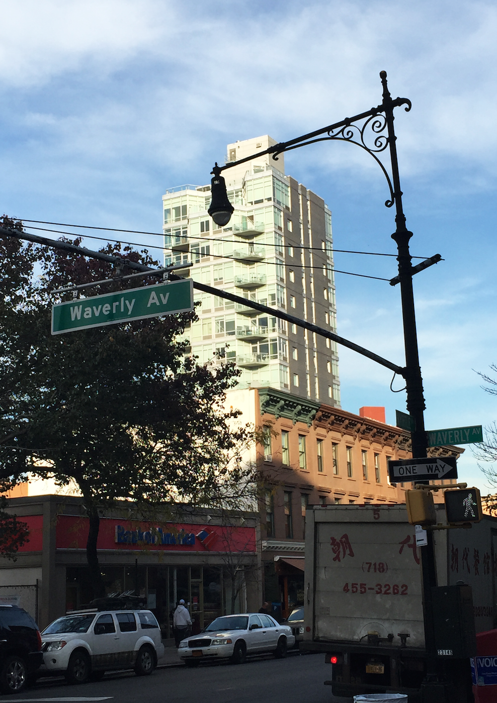
A point of comparison always provides a helpful place to start. Though there are any number of towers on 57th Street that could fit the bill, I choose to look instead to my own neighborhood: Clinton Hill, Brooklyn. A sixteen-story tower at 163 Washington Avenue, designed by Karl Fischer, attracted its fair share of criticism before and after its 2010 completion. This was due to many of the same factors that have inspired reticence to accept 432 Park, numbers one and two on the list being interrelated: extreme relative height and dissonance with local context.6 These qualities encouraged the building’s entirely apt nickname, “The Finger.” With a mixed façade of brick and glass, straightforwardly stacked floor-plates, and factory-line fenestration, the building will look familiar to residents of cities across the globe who are increasingly accustomed to the blunt-force architectural effects of rapid gentrification.7 Walking around in the neighborhood under The Finger’s glare, one is reminded of the legend—recalled by Roland Barthes in his seminal essay on the Eiffel Tower—that Guy de Maupassant, one of the structure’s earliest and fiercest critics, dined in its restaurant every day simply to avoid seeing it.8 The obvious difference here being, of course, that getting a meal isn’t the same as buying a condo. For better or worse, as Barthes helped us understand, such towering, markedly out-of-context buildings are everywhere, in all fields of vision—eventually permeating even our imaginations with their willful independence.
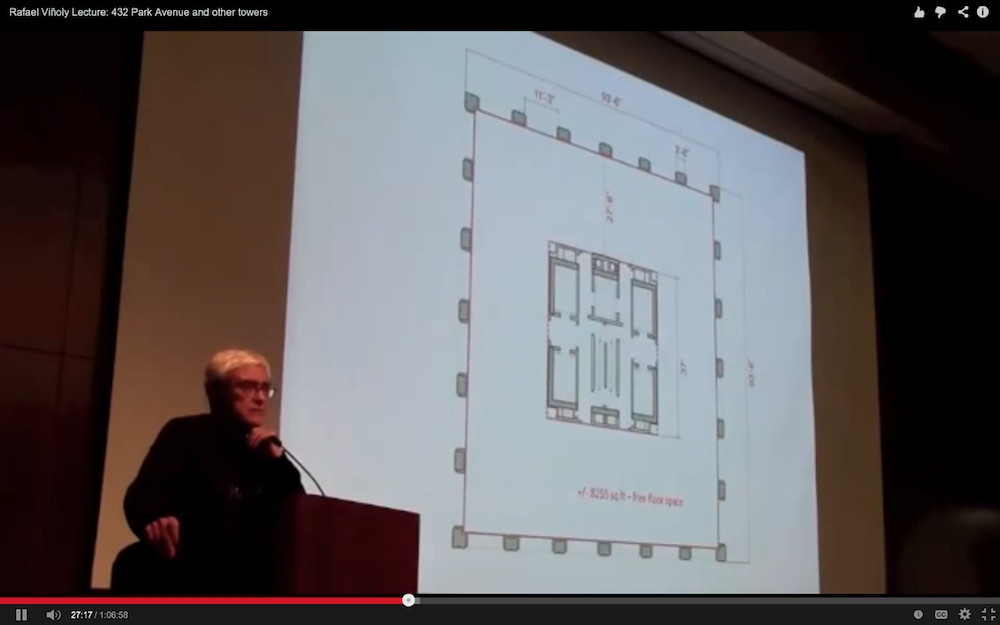
In this respect, 432 Park is no exception. As mentioned previously, however—and as was surely said in defense of the Eiffel Tower—432 Park offers something different than the city developers’ everyday genericism. According to Viñoly, “In the constellation of new forms, it’s surprisingly calm.... I like the fact that the grid is not just a façade; it’s not just the structure; it’s how the building works. Architecture has gone through a very whimsical phase. But I think rigor is also a very important mantra.”9 10 Accordingly, for this seemingly straightforward ninety-six-story, 1,396-foot-tall tower designed and constructed as-of-right, an efficient central core and uniform, structural concrete façade are the organizing design elements. This leaves each of the 104 condos open to the inevitably individualized desires of its super-rich future occupants (or LLCs).11 The half-floor or full-floor residences, each with 12-foot-6-inch ceiling heights, begin above 300 feet, grouping amenities and service areas below. Six double-height baffles mitigate the effects of wind on the tower’s slender form. The identical 10-by-10-foot picture windows that form the façade’s grid—six per floor per side—seem to telegraph the well-worn (though still desirable) marketing logic: Luxury should be simple, because life sure isn’t.
Confronted with Viñoly’s self-described “rigor,” especially in the face of the very different approaches by similarly well-known architects in close proximity, one might be reminded of the recent hubbub caused by Frank Gehry while he was in Spain to accept the prestigious Prince of Asturias Prize. When asked to respond to accusations that his architecture was simply “spectacle,” the architect initially needed no words to express his thoughts about the question. Then, after a “long silence,” Gehry explained, “In this world we are living in, 98 percent of everything that is built and designed today is pure shit. There’s no sense of design, no respect for humanity or for anything else. They are damn buildings and that’s it.” 12 Though he later blamed jet lag, Gehry’s gruff reaction helpfully articulates the apparent battle lines for architects today—between design and development, high-mindedness and bottom lines—a split echoed and elided somewhat more surreptitiously by Viñoly’s labeling of Macklowe “a truck driver with an education in aesthetics.”13 Unfortunately for Gehry, what’s implied in his reductive provocation is that it’s therefore left up to the 2 percent he so righteously defends to define exactly what Architecture can be (and mean) in the face of such dispiriting conditions. In this light, the critique of luxury buildings that look like luxury handbags (or vice versa?) is as justified as the critique of that other “98 percent” of buildings for which the value engineer is the only evident architect.14 15
Channeling Gehry’s anxious flash, Viñoly’s distanced restraint, and Barthes’s belief that “use never does anything but shelter meaning,” it’s tempting to try to further unpack 432 Park’s “insolent” grid—or, more accurately perhaps, the grid’s main character, the square—as the central aesthetic signifier of its design.16 One of the most repeated and repurposed motifs in Western architectural history, the square’s abstraction and symbolism have served as potent weapons in many, often contradictory ways.17 And yet, Viñoly and other commentators don’t dwell on it with any specificity in their discourse. Disassociating himself from the motivations, guidelines, and taste of not only the developers but also the future residents, Viñoly simply aligns himself with an educated public that identifies with his (and Gehry’s) technical and artistic ambitions.
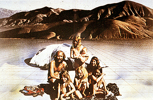
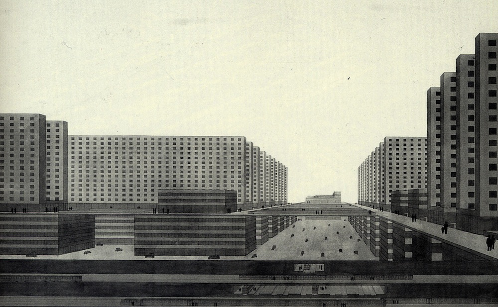
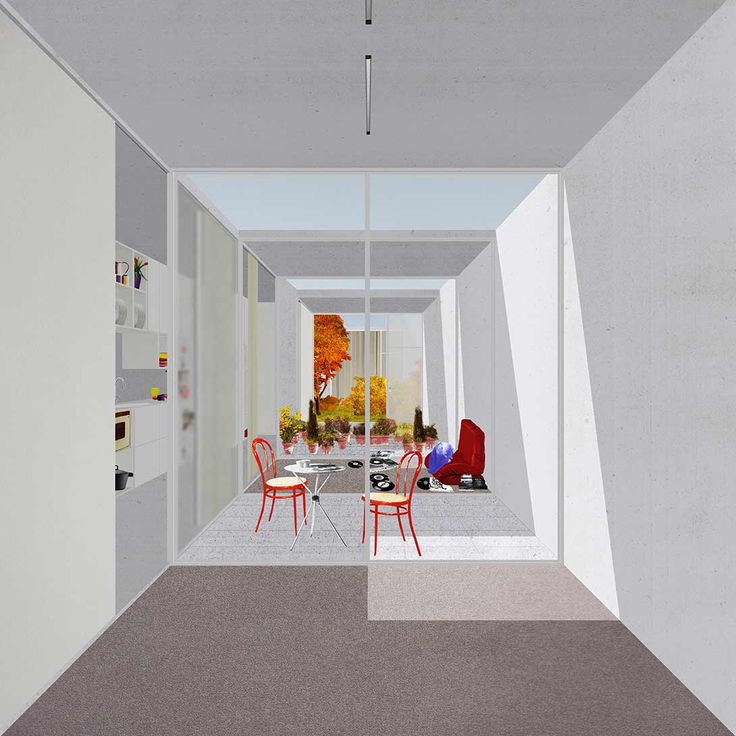
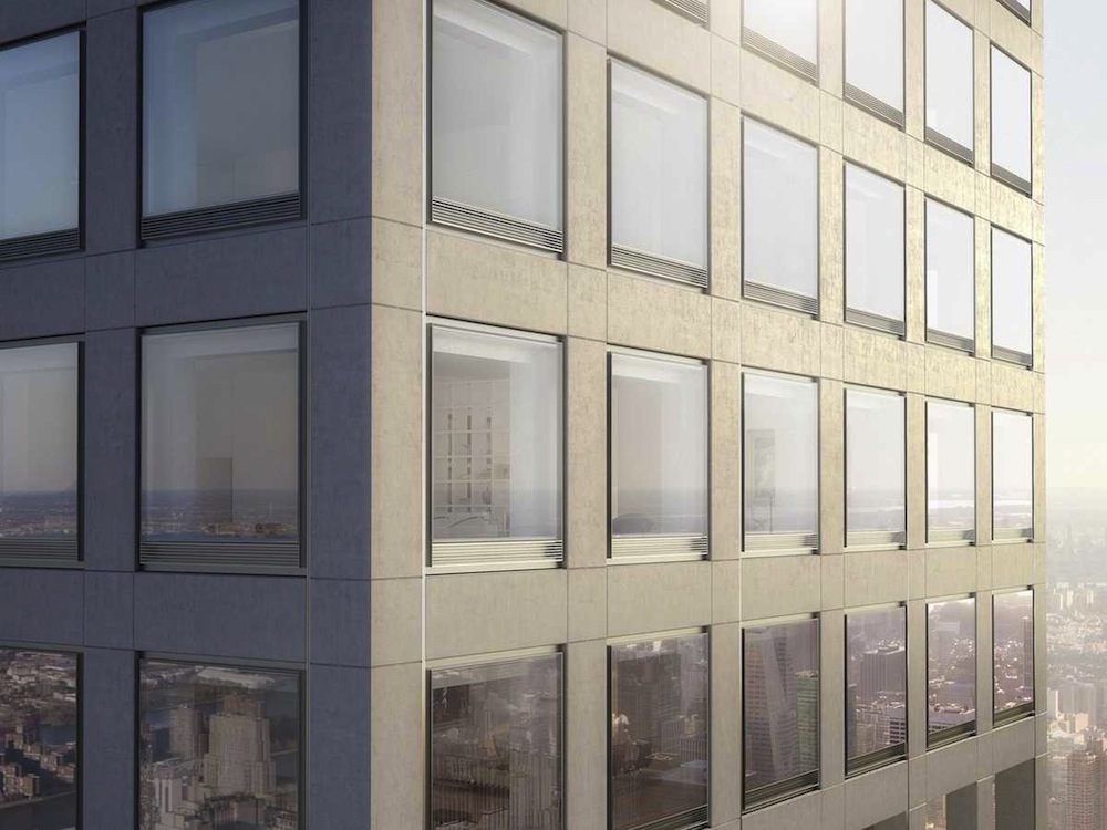
Valiant in the face of what he calls “the penis business”—apparently made up of truck drivers—this gesture alone is nearly enough to facilitate the aforementioned whispers of approval.18 The “Palladian Proportioned Spaces” extolled in the building’s marketing material and Architectural Record’s praise of its “Miesian restraint” echo what are ultimately nebulous claims to historical importance which nod toward the façade’s rationality without requiring further explication.19 In the realm of symbolism then, this structuring conceit is only intended to serve as the most visible evidence of the design’s Architectural bonafides.
This being said, 432 Park isn’t exactly what Barthes calls an “empty” signifier—meaning nothing and therefore everything all at once.20 In line with its marketable understanding of luxury, the building’s accessible architectural logic suggests that the free-flowing, financialized capital that so literally gives this building its form and occupies its apartments might have an equally aestheticized, if slightly more tangled structure that’s also ripe for redesign. Unlike Gehry, Viñoly here leverages modernist tropes in order to make the abstractions that both produce and are produced by contemporary architecture into something just a little more legible.21 In the same way that Lamb’s Empire State Building or Yamasaki’s World Trade Center could be said, in hindsight, to carry messages about the eras in which they were made, in 432 Park we can read some of late capital’s own forces at work. Here, myths such as the democratic equanimity of the market and the rationality of global capital—performed in the repetition of squares, the flexibility of plans, and the durability of materials—are exposed in the act of their reproduction.
In this sense, the building provides an optimistic epilogue to Barthes’s concluding ruminations on the sensations of a visitor granted access to his own Parisian tower of inquiry: “One can feel oneself cut off from the world and yet the owner of a world.”22 For those of us back down here on the New York City street, squinting our eyes as we look up at 432 Park, it’s a little bit easier to imagine that next time, the symbolic finger and its attendant repudiations might be directed toward someone else. And, as you might have guessed, I actually really like it.
-
Rafael Viñoly as quoted in Alan Feuer and Charles V. Bagli, “Harry Macklowe Gambles Again,” the New York Times, October 4, 2013, nytimes.com/2013/10/06/nyregion/harry-macklowe-gambles-again.html. ↩
-
Macklowe has said as much on several occasions, for instance he was quoted in Feuer and Bagli “Harry Macklow Gambles Again” as saying: “In my career of 50 years, this is the true distillation of everything I’ve learned. This is it....” ↩
-
Viñoly is part of a large team that includes SLCE, Macklowe Properties, CIM Group, and a bevy of other partners including Deborah Berke and DBox. 432parkavenue.com, accessed November 21, 2014. ↩
-
There have been numerous criticisms of these new towers, which include projects by Jean Nouvel (53 West 53rd St.), Christian Portzamparc (157 West 57th St.), SHoP (111 West 57th St.), Adrian Smith and Gordon Gill (225 West 57th St.), and Robert A.M. Stern (220 Central Park South). See Alexandra Stevenson and Julie Creswell, “Bill Ackman and His Hedge Fund, Betting Big,” the New York Times, October 25, 2014, nytimes.com/2014/10/26/business/bill-ackman-and-his-hedge-fund-betting-big.html; Paul Goldberger, “Too Rich, Too Thin, Too Tall?” Vanity Fair, May 2014, vanityfair.com/culture/2014/05/condo-towers-architecture-new-york-city;Julie Satow “Pied-à-Neighborhood,” the New York Times, October 24, 2014, nytimes.com/2014/10/26/realestate/pieds-terre-owners-dominate-some-new-york-buildings.html; or Stephen Rustow, “The Privatization of Prospect,” Urban Omnibus, December 3, 2014, urbanomnibus.net/2014/12/the-privatization-of-prospect. ↩
-
This is not meant metaphorically. While writing this article I was repeatedly denied access to the tower for informational purposes. This closure to non-investors will undoubtedly continue well into the building’s foreseeable future. ↩
-
See “163 Washington” in Curbed (ny.curbed.com/tags/163-washington) for coverage from the last decade about this building, one of several so-called “fingers” in New York. ↩
-
Though these effects could be attributed simply to rapid “growth” and not necessarily “gentrification,” it’s important to note that cases where new residential construction allocates a significant proportion to permanently affordable housing is minimal, especially in the United States. ↩
-
Roland Barthes, "The Eiffel Tower," in The Eiffel Tower and Other Mythologies trans. Richard Howard (New York: Hill & Wang, 1979), 3. ↩
-
Fred Bernstein, “Newsmaker: Rafael Viñoly,” Architectural Record, February 26, 2014, archrecord.construction.com/news/2014/02/140226-Newsmaker-Rafael-Vi241oly.asp. ↩
-
One might want to consider Viñoly’s skyscraper-as-grid in relation to Rem Koolhaas’s theorization of the city grid giving rise to the skyscraper. See: Rem Koolhaas, Delirious New York: A Retroactive Manifesto for Manhattan (New York: Monacelli Press, 1994). ↩
-
“It’s a structural solution that is totally connected to the market. The odds that people paying this kind of money are going to like the model apartment are about one in a thousand. With this design, there is no structure in the body of the plan, only in the perimeter and the core. That gives owners the flexibility to build their own apartments, without interrupting structure or services” Viñoly quoted in Bernstein, “Newsmaker: Rafael Viñoly.” ↩
-
Stephen Burgen, “Frank Gehry gives journalist the finger,” the Guardian, October 24, 2014, theguardian.com/artanddesign/2014/oct/24/frank-gehry-journalist-finger-architecture-shit. ↩
-
Feuer and Bagli “Harry Macklowe Gambles Again.” For further backstory on Macklowe, see Marcia Chambers’s “Guilty Pleas Entered in Demolition at Times Sq.”, the New York Times, May 8, 1985. ↩
-
This is in direct opposition to the October 27 commentary by Peter Schjeldahl in the New Yorker (“Frank Gehry’s Digital Defiance”: newyorker.com/culture/cultural-comment/frank-gehry-digital-defiance). ↩
-
Emily Anderson, “Rihanna Carries Louis Vuitton Bag Designed by Frank Gehry,” Purse Blog, October 21, 2014, purseblog.com/celebrities/rihanna-carries-louis-vuitton-bag-designed-franky-gehry. ↩
-
Barthes, The Eiffel Tower and Other Mythologies, 7; Schjeldahl, “Frank Gehry’s Digital Defiance”. ↩
-
Beyond the cursory selection of images here, interested readers might see Rosalind Krauss’s 1979 essay, “Grids,” originally published in October and available in Hannah Higgins’s The Grid Book (Cambridge: MIT Press, 2009). In this case, the contradictions between the square’s inscribed historical narratives and their present-day deployment are notably perverse. ↩
-
Feuer and Bagli “Harry Macklowe Gambles Again.”; Viñoly Architects homepage, rvapc.com. For additional commentary by Viñoly on differences in taste with incoming residents, see his February 24, 2013, lecture presented by the Skyscraper Museum: youtube.com/watch. ↩
-
Bernstein, “Newsmaker: Rafael Viñoly.” ↩
-
Barthes, "The Eiffel Tower," , 7. ↩
-
For more on architecture and abstraction, in particular as it’s linked to Gehry’s IAC building, see Reinhold Martin’s essay “Financial Imaginaries” in his book, Mediators: Aesthetics, Politics, and the City (Minneapolis: University of Minnesota Press, 2014). ↩
-
Barthes, "The Eiffel Tower," 17. ↩
Jacob R. Moore is a New York–based critic, curator, and editor in architecture.

