Christopher Nolan’s Interstellar was nominated for five Oscars. The movie won the Oscar for Best Visual Effects, many of which were created with analog camera techniques. It has been controversial for its use of emotional themes, and its scientific accuracy. The physics in the film is either shockingly sloppy, or accurate enough to generate new peer-reviewed research, depending on which review you read.1 2 But the best and most curious thing about Interstellar is its topology.
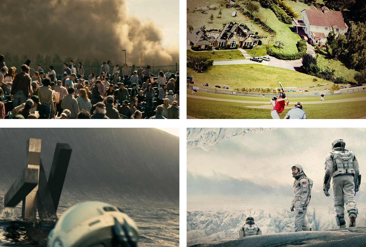
Again and again, in different ways, we see the ground lifting up to become the sky. The first appearance of this effect is early in the movie—the horizon-obliterating dust storms that sweep across the American Midwest. Cooper (the main character) and his family are at a baseball game when a dust storm rises, looming like a growing mountain. Drought and blight have killed the plant life that binds the soil, the near-future world of the movie has become a dust bowl, and as fields go fallow the end is nigh. Unrooted and at the whim of strong winds, earth is stirred into massive clouds that block the sun and kill still more plants. Soil, which when healthy is an intricate, living system, constantly changing in time, has lost its organic components, becoming mere mineral again, simple inert matter wiping out the sky.
In the movie’s final scenes, this scenario is inverted. The last survivor of a crew sent through a wormhole to find a new planet for humanity to live on, Cooper wakes up in a hospital room; he looks out a window and sees another baseball game. He has been transported back from his voyage through time and space to find life familiar on a satellite colony. The batter hits a fly ball and the camera follows it up into what should be the sky. But instead of empty space, the ground has looped up and turned over us. The ball breaks the skylight on a suburban house overhead. Cooper is inside an O’Neill Cylinder, a vast space habitat, with occupiable territory on the inner surface, sealed against a vacuum, and spun for artificial gravity.
In between these two bookends and baseball games, we see many variations on the theme. As their spacecraft leaves Earth, the geometry of the film’s wormhole, and its ability to connect the spaces in separate galaxies, millions of light-years away, is explained topologically, with folding paper. Ordinary space, it is shown, is like a flat sheet. To get somewhere, the intervening space must be traversed. But a wormhole has the ability to fold space over and back onto itself, with two points on the flat surface overlaid and linked in higher dimensions by a puncture.

On the other side of this wormhole, there is another solar system, with a surprise in the center, a black hole surrounded by an accretion disk of glowing matter. The surface of this disk tips up smoothly from horizontal to vertical. The black hole’s ability to distort light around it means that even though it appears as a black circle in space, light bends around from the back, and it is impossible for the circle to occlude anything. You can’t hide behind a black hole. We are seeing the back of the accretion disk, as its light is bent up and around, like the ground in the O’Neill Cylinder. This visual effect had never been modeled before, and emerged from consultation with astrophysicist Kip Thorne, one of the film’s executive producers.3
As the film’s astronauts begin to explore the planets orbiting the black hole, in every case, each world’s inhabitability turns out to be tied to the issue of ground becoming sky. The first planet they visit is covered in water. In shots that echo the dust storm’s clouds of moving ground, we see massive waves, stirred by the gravity of the black hole, reaching miles into the sky, that sweep across the planet, preventing any occupation. The astronauts retreat, one of them dead. On the second planet, there is only ice, and an atmosphere barely warm enough to breathe. Here also, there is solid matter in the sky. The masses that the astronauts walk on also hover overhead, suspended in the light gravity. This is the case, they learn, all the way down. There is no ground. The planet has no surface, only porous ice and snow. There is nothing stable, no datum to rest on, occupy, or measure things with, only a sky filled with solid, inhospitable stuff.
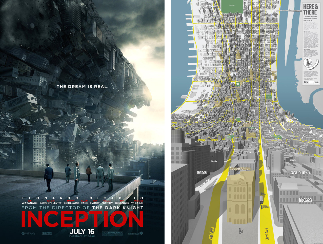
This theme of ground becoming sky has been used by writer/director Christopher Nolan before. In Inception, the logic of that movie’s dream world allows its architects and creators to fold the surface of Paris up and over itself, roll the city up like a tube, and lock the tops of building together. The dream’s architects can enable cars to drive on vertical streets, and they can reconfigure the city so that areas once separated by geography are now linked, like the distant galaxy in Interstellar’s wormhole.
The depiction of this effect in Inception may have been influenced by a pair of maps released shortly before the film’s production, by the (now sadly defunct) London-based design studio BERG. Here & There shows Manhattan south of Central Park from two directions; in each view the landscape is horizonless and concave, allowing for an experiential representation of the viewer’s immediate surroundings, and also showing the big picture clarity that comes with an aerial view of the city’s layout in the distance. In the words of the map’s designers, “Because the ability to be in a city and to see through it is a superpower, and it’s how maps should work.”4

The first appearance of an O’Neill Cylinder in science fiction may be the City of Space, in Jack Williamson’s 1931 novella The Prince of Space. From the start, as soon as the city is introduced, the same panoptic visual effects are described, along with the peculiar property of connection between otherwise distant spaces:
“They were, Bill saw, at the center of an enormous cylinder. The sides, half a mile away, above and below them, were covered with buildings along neat, tree-bordered streets, scattered with green lawns, tiny gardens, and bits of wooded park. It seemed very strange to Bill, to see these endless streets about the inside of a tube, so that one by walking a little over three miles in one direction would arrive again at the starting point, in the same way one gets back to the starting point after going around the earth in one direction.”5
Such structures are laid out in a way that allows anyone to possess the superpower of sight at a distance, with simultaneous experience close at hand, as described in “Here & There.” Just like the folded Paris in Inception, the horizon wraps up and over the viewpoint, connecting places that would otherwise remain distant. Designer and visual futurist Syd Mead, describing his work illustrating large, rotating space colonies for National Geographic in the 1970s, and later designing one for another science fiction movie, Neill Blomkamp’s Elysium, called this effect “inverse perspective.”6
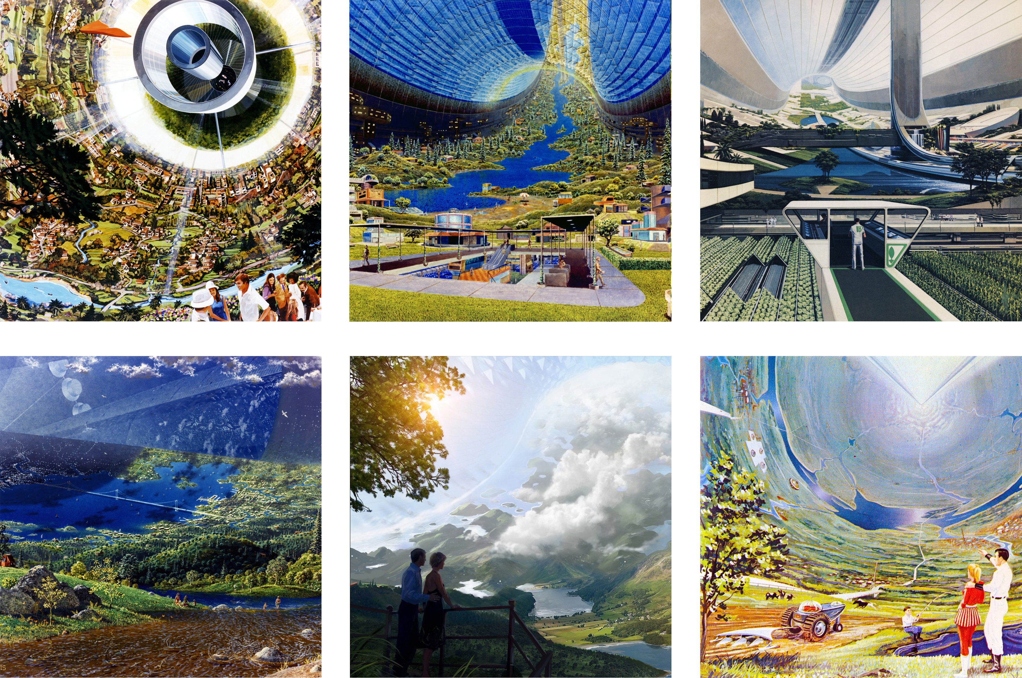
This sense of ownership and understanding that comes with this superpower is evident in many illustrations of such spaces. Roy Scarfo’s 1964 painting of a hollow asteroid space colony, made with engineer Dandridge Cole for their book, Beyond Tomorrow, is maybe the first attempt to show a space like this in perspective.7 We see two figures next to a fishing pond in the foreground, with a landscape of farms and small cities curving away beyond and above them. A dark-haired male figure has his arm around a blond woman; he is gesturing paternalistically to the landscape, as if to show and explain it all to her. In a similar painting, made with a NASA research grant to study the feasibility of large-scale structures in space, in 2013, an almost identical scenario is visible. Now it seems the couple is older, and instead of an arm on the shoulder, the man has his hand on the woman’s waist. They gaze off into the upturned landscape. Maybe they have chosen to cash out their investments on earth and retire here.

O’Neill Cylinder Interior, Don Davis for Gerard O’Neill and NASA, 1975.
Physicist Gerard O’Neill, the eponym of the O’Neill Cylinder, has done the most to popularize the idea of large-scale rotating habitats in space. In 1975, a NASA-funded conference held in conjunction with Stanford University brought O’Neill together with architects, planners, engineers, and artists to work out detailed designs and proposals for these. Two painters, architect Rick Guidice, and science illustrator Don Davis created a series of visualizations for NASA that are now in the public domain, and widely circulated. One image, of a large O’Neill Cylinder interior, seen from a meadow, with a city and a bridge in the distance, was painted by Davis. As O’Neill seems to recall this painting, in his 1976 book The High Frontier:
“Even at the high-population density that might characterize an early habitat, that arrangement would seem rather pleasant: a house in a small village where life could be relaxed and children could be raised with room to play; and just five or ten miles away, a small city, with a population somewhat smaller than San Francisco’s, to which one could go for theaters, museums, and concerts.”8
In the publication released as the official record of the 1975 conference, the report’s authors speculate that this viewpoint might have detrimental effects on the psychological well-being of the structure’s inhabitants. Awareness of isolation, crowding, and artificiality might stress the colonists, and they suggest designing the structure’s interior so that these privileged long views might be limited, lest they show the inhabitant just how small their pocket world really is: “To this end it may be desirable to limit a colonist’s view so that the entire structure cannot be seen in a single scan by designing it so that some parts are always out of sight of others.”9
Instead of downplaying it, other writers, painters, and filmmakers have chosen instead to focus on this effect. The painters of space habitats that utilize inverse perspective have taken the valleys of the Hudson River School and wrapped them up over themselves into the sky. The horizon no longer folds away in the distance of the New World. If a sense of open-endedness is lost here, what’s gained is a certain implied accessibility and engagement. Like Albert Bierstadt in a bottle—all of the sublime without any of the infinite, these paintings show worlds large enough to invoke endless expansion, but small enough that the subject is able to feel a sense of propriety over them.
In the paintings created by Davis and Guidice for O’Neill’s 1975 conference, there is a tension between the open wilderness of the frontier and the closed legibility of the suburbs. De Witt Douglas Kilgore, in his book Astrofuturism, argues that O’Neill’s work on space colonization doesn’t take advantage of the potential that the ability to create new worlds from scratch implies.
“Given that escape is the only option O’Neill can imagine, and given that in both instances escape is motivated by fear of alterity and a passion for homogeneity, it is difficult to detect the difference between white flight in the America of the 1970s and the humanization of space by the common people that he imagines. In neither case is the political imagination fully extended. The regenerative promise of a new frontier falls before business as usual.”10
The O’Neill Cylinder we see in Interstellar doesn’t just represent the end of a series of hostile and dangerous inversions of ground and sky. It is the continuation of a topological theme that climaxes with the simultaneous fold of both space and time within the wormhole, where the movie’s two sides are reconnected by the intervention of the hero from the future. The theme of the closure of landscape around the subject also implies that, in the creation of the O’Neill Cylinder’s inverted topology, we have inverted the apocalyptic effects of the anthropocene that characterize the portions of the movie taking place on Earth. Ground has become hostile—it is our fault—and in the film, humankind has shown itself worthy of survival because it has mastered ground. But the new ground that we have created, with its baseball fields, single-family homes, and even a re-creation of Cooper’s farmhouse, fails to follow through on the promise of a new culture to go along with a new world. Humanity in the film has folded ground around itself and left, just as it has folded time to ensure its own continued existence. Even with this dominion over space and ground, we remain vulnerable to the flaws and blind spots inherent in the new worlds of the past.
-
Phil Plait, “Interstellar Science: What the movie gets wrong and really wrong about black holes, relativity, plot, and dialogue,” Slate, slate.com/articles/health_and_science/space_20/2014/11/interstellar_science_review_the_movie_s_black_holes_wormholes_relativity.html, accessed February 24, 2015. ↩
-
Adam Rogers, “Wrinkles in Spacetime: The Warped Astrophysics of Interstellar,” Wired, wired.com/2014/10/astrophysics-interstellar-black-hole, accessed February 24, 2015. ↩
-
We can see traces of the geometry of the O’Neill Cylinder, and its cousin, the Bernal Sphere, in the large, simple volumes of space created by visionary French Neoclassical architect Étienne-Louis Boullée. In Boullée’s Royal Library project of 1785, the tiered stacks of books climb the walls, and their dimensions are repeated overhead in the vaulted ceiling’s coffers. In his project for a Cenotaph, or Empty Tomb, for Isaac Newton, the space is a huge sphere, with a curved ground plane becoming a domed sky overhead, lit by a central sun at night, and by tiny holes like stars during the day. In these projects, the occupiable surface that the subject stands on is continuous with the surfaces that enclose the volume on the sides and overhead. This surface, whether composed of the national collection of books, or representations of stars, is at once both present at hand, and transcendently distant. ↩
-
The possession of the superpower subjective viewpoint in a space like this, and the privilege that comes along with it also has roots in the panorama painting displays of the 19th century. The most famous of these is the Atlanta Cyclorama, once the largest oil painting in the world, this depicts the Civil War battle of Atlanta, with what was, at the time, spectacularly high technology. Visitors arrive in a cylindrical room from a hole in the center, while the painting slowly rotates around them. Like the visuals in Interstellar, these are analog special effects, presenting a landscape wrapping around the viewer. ↩
-
Jack Williamson, “The Prince of Space,” in The Space Opera Renaissance, David G. Hartwell, Kathryn Cramer, editors (New York: TomDoherty Associates, 2006), 59. ↩
-
Roy Gallant, National Geographic Picture Atlas of Our Universe (Washington, D.C.: National Geographic Society, 1980), 269. ↩
-
Dandridge M. Cole and Roy Scarfo, Beyond Tomorrow: The Next 50 Years in Space (Amherst: Amherst Press, 1964), 93. ↩
-
Gerard K. O’Neill, The High Frontier (New York: William Morrow and Company, 1976) 65. ↩
-
NASA, Space Settlements, A Design Study (Washington, D.C.: Scientific and Technical Information Office, 1977). ↩
-
De Witt Douglas Kilgore, Astrofuturism: Science, Race, and Visions of Utopia in Space (Philadelphia: University of Philadelphia Press), 172. ↩
Fred Scharmen is a designer, artist, and researcher. He teaches architecture and urban design at Morgan State University in Baltimore.

