Struck
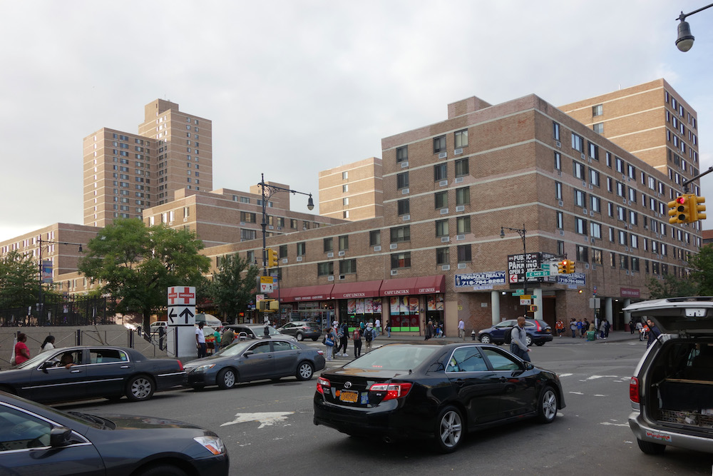
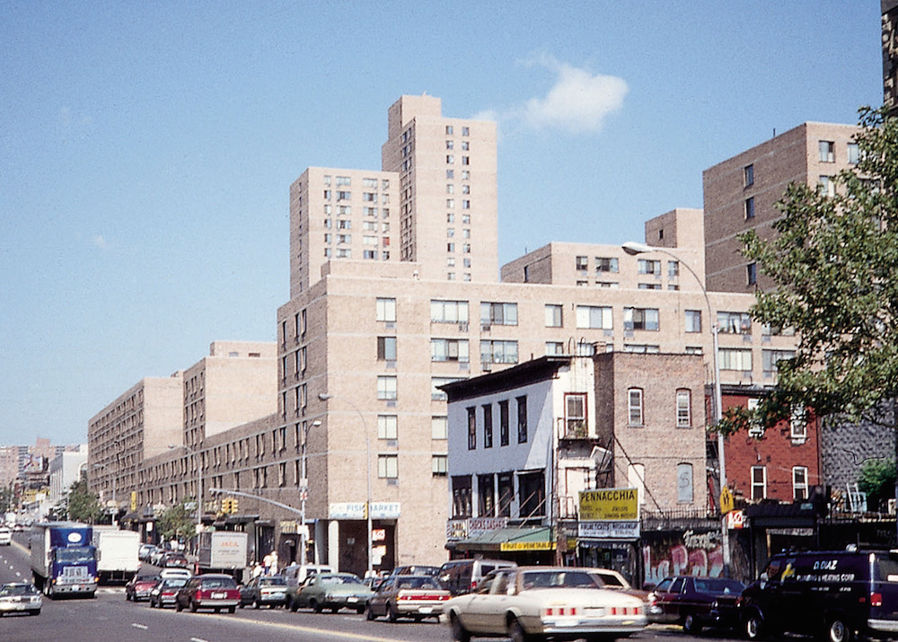
What is that? I thought, walking up Morris Avenue. We were on a site tour of the South Bronx, weaving our way north from the waterfront on 135th Street, heading to the must-see Via Verde.1 Past the numerous car repair shops and unexpectedly bucolic public housing, there it was—a striking, full-block building along 149th Street, made of a single beige-colored brick, sculpted to various heights, clearly housing (given the repetitive windows) but astonishingly composed to be entirely non-repetitive, a whole. I was amazed. Here was a building, in New York, reminiscent of 1990s Berlin in its strict adherence to a rigorous street wall and the principles of punched façades, and yet much more playful, as if the result of one of those 2000s Dutch urban design books, written to stimulate variation within a set of rules. It was not possible to date this building. Perhaps the 1980s? The 1970s were not yet a time of such strict street-wall urban design, but in the 1980s, the then abandoned and burnt-out Bronx was being repopulated by single-family homes, not multi-family structures. And by the 1990s housing had become ornamented again. The building’s audacious embrace of low-, mid-, and high-rise; its integration of commercial space all along 149th Street; its willingness to embrace the density of urban residential architecture instead of trying to be pretty—made it at once old and new.
Discourse
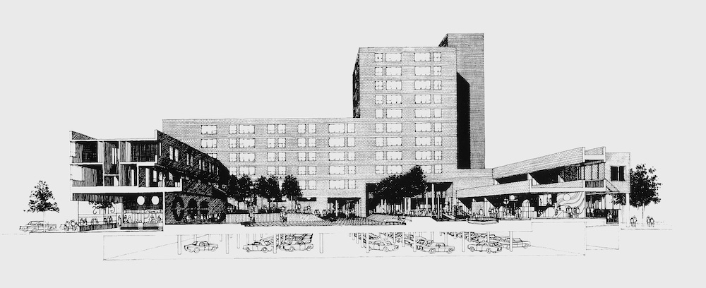
After identifying the building by its address as the “Michelangelo Apartments,” I search the reliable troves of New York City building history. Nothing in Stern.2 Nothing in Plunz.3 Nothing in the Avery Index.4 The first published clue I find in the generally recognized body of architectural knowledge is in the third edition of Willensky and White’s AIA Guide to New York City.5 In it, the authors focus exclusively on Michelangelo’s façades, characterizing them as “flat, uninteresting.” For including the building, I pardon their dismissive tone—attributable to the book’s postmodern times—and thank them for dating the building to 1975, identifying the architects, Weiner & Gran and Jarmul & Brizee, as well as the sponsor, the New York State Urban Development Corporation (UDC). When I find Warren Gran, he is happy to talk (“you must be one of three people who likes this building”), sends me what he has in his files, and agrees to speak more extensively in person. But alas, neither Gran nor David Kriegel, a later professional partner, have many images in their files. The professional record of this building, originally referred to as “Melrose D-1,” consists of one site plan, one cross-section, one overall axonometric, one exterior photograph, and four courtyard photographs. Not a single floor plan! This prompts two parallel questions: What does it mean for architectural discourse when a major (and remarkable) building is never reviewed or published? And what does it mean for architectural history when there is hardly a record left to work from? Clearly, there are many buildings that go unwritten, since editors (and authors) select the ones they want to hail, not dismantle. Clearly, some architects consider their work to be of supreme importance and save everything from the very earliest moment, while others don’t. But in an odd way, Melrose D-1 is a building that appears to be discursive—it puts forth a clear proposition for housing and how it should address the city—but neither it nor its architects ever found a place in that discourse.
Inverse Trajectory
It usually goes the other way around. Buildings are reviewed upon their completion, most often prior to occupancy, and are then—save the few that become canonical in curricula and as subjects of precedent analysis assignments—forgotten altogether. The other UDC work produced under the agency’s active housing development between 1968 and 1975, tended to be celebrated upon completion, then dismissed decades later. Take Twin Parks, a 2,000-plus-unit scattered-site urban renewal project a bit further north in the Bronx, begun in the late 1960s. It was reviewed by Kenneth Frampton, Suzanne Stephens, and Manfredo Tafuri, among others, in publications including Oppositions, L’Architecture d’Aujourd’hui, and a+u.6 The project was positioned within the emerging discourse on “context” and the established debate on “typology.” But could anyone sketch Richer Meier’s unusual urban design today? Or the section of Giovanni Pasanella’s floor-through split-level units? Likely not. Marcus Garvey Village in Brownsville, Brooklyn, another UDC project and a contemporary of Melrose D-, received an equal amount of attention as did Twin Parks initially, in part because the center of New York City’s architectural discourse, the Institute for Architecture and Urban Studies, signed as its design architect, but also because it embodied the UDC’s policy shift from high- to low-rise, high-density development. This project has recently resurfaced, sometimes as an example to be emulated but more often as a cautionary tale about a perceived disjunction between architecture and low-income housing—utopian vision then, dystopian reality now.7 8 Melrose D-1 has been subject to neither form of review. Why?
Untimely 9
If the building’s earlier lack of review was just bad timing, the present cause is surely its utter non-spectacularity. At the time of its completion in 1975, the UDC was under severe distress financially and about to be shut down and stripped of its housing development activities. In January 1973, Richard Nixon had issued a moratorium on all federal spending on low- and moderate-income housing and urban renewal projects, which deeply affected the UDC since it had relied on the subsidies when leasing the new buildings. By the time new programs were instituted in the fall of 1974—including portable vouchers to encourage low-income residents to find housing on the open market rather than financing the new construction of housing—the UDC, as a housing development agency, had been closed down. Large-scale was out, as far as the discourse was concerned, and with almost 500 apartments, Melrose D-1 qualified as large-scale. In fact, housing was out altogether. The one other article I ultimately did find that referenced Melrose D-1 was written on the occasion of the UDC’s demise, in Architectural Record’s “Building Types Study” series, titled not “Housing,” as one might imagine such a study to be called, but rather “Crisis in Housing.”10 The article discusses the inherent contradictions of a State agency commissioning large numbers of housing complexes based on a financing model that relies on private investors buying its bonds. At the same time, it emphasizes a number of achievements in areas like systems, speed, replicability, and the integration of social services with the housing. (If this sounds familiar, it shows how little the requirements of housing have changed in the past forty years.) The piece’s author, Charles Hoyt, positions Melrose D-1 as a response to earlier UDC projects like Twin Parks, which had originally left open spaces accessible to nonresidents that were then, for security reasons, “quickly fenced with chain-link fabric.” Even Wilhelm Ronda, current director of planning and development at the Bronx Borough President’s Office—who is not a fan of the housing built in the 1960s and 1970s, preferring the now generally accepted principles of street walls and sight lines from street all the way to the elevators—calls Michelangelo “ahead of its time.”
Edited
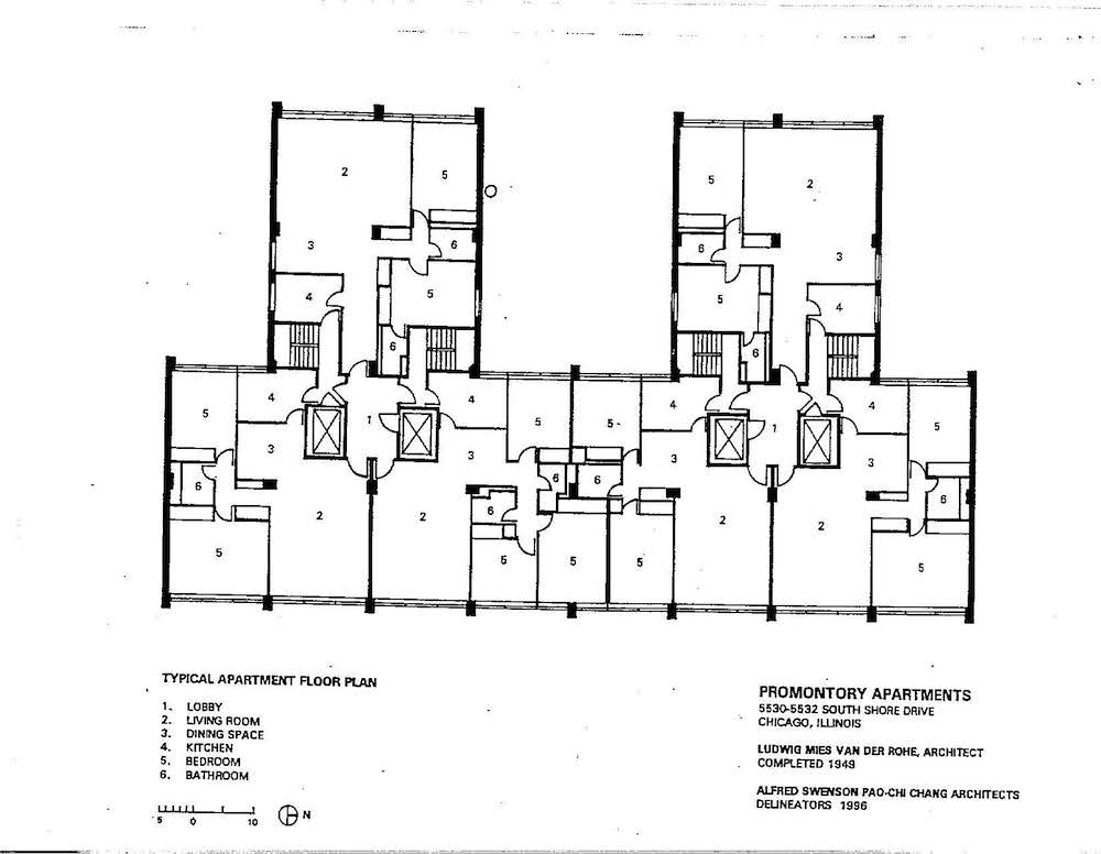
There is another form of being unreviewed—hiding in plain sight. This takes place in the oeuvres of well-known architects. The repeated circulation of selected images constructs an incomplete picture of a building. Looking recently at Ludwig Mies van der Rohe’s Promontory Apartments in Chicago (his first high-rise, completed in 1949, and in its exposed concrete frame always presented as an immediate forerunner to steel-frame Lake Shore Drive), I realized that the building’s floor plan does not seem to exist. I looked through the library shelf—Blaser, Cohen, Lambert—and not a single one of these monographs shows the plan.11 Models, yes. Angled exterior partial photographs, yes. Why? Because the plan is awkward—not the pristine rectangular geometry unaffected by building orientation, neighbors, or views. If you look closely, this is not a tower plan but an extruded piece of Berlin’s nineteenth-century city block. It’s not one but two buildings, side by side, articulating a clear street front on one side and a courtyard side on the other. The apartments are not open plans, as our learned image of Mies might make us imagine, but instead follow the needs of a traditional bourgeois household with a front and a back entrance (that back entrance and stair being right off the kitchen) and a clear separation of the public living rooms from the private bedrooms. The Promontory plan works well—units have two exposures and the building responds to its immediate neighbor. But it doesn’t fit the linear narrative of the master’s work and hence was never published. The building was reviewed not for what it is, but as a precursor of something to come.
Project
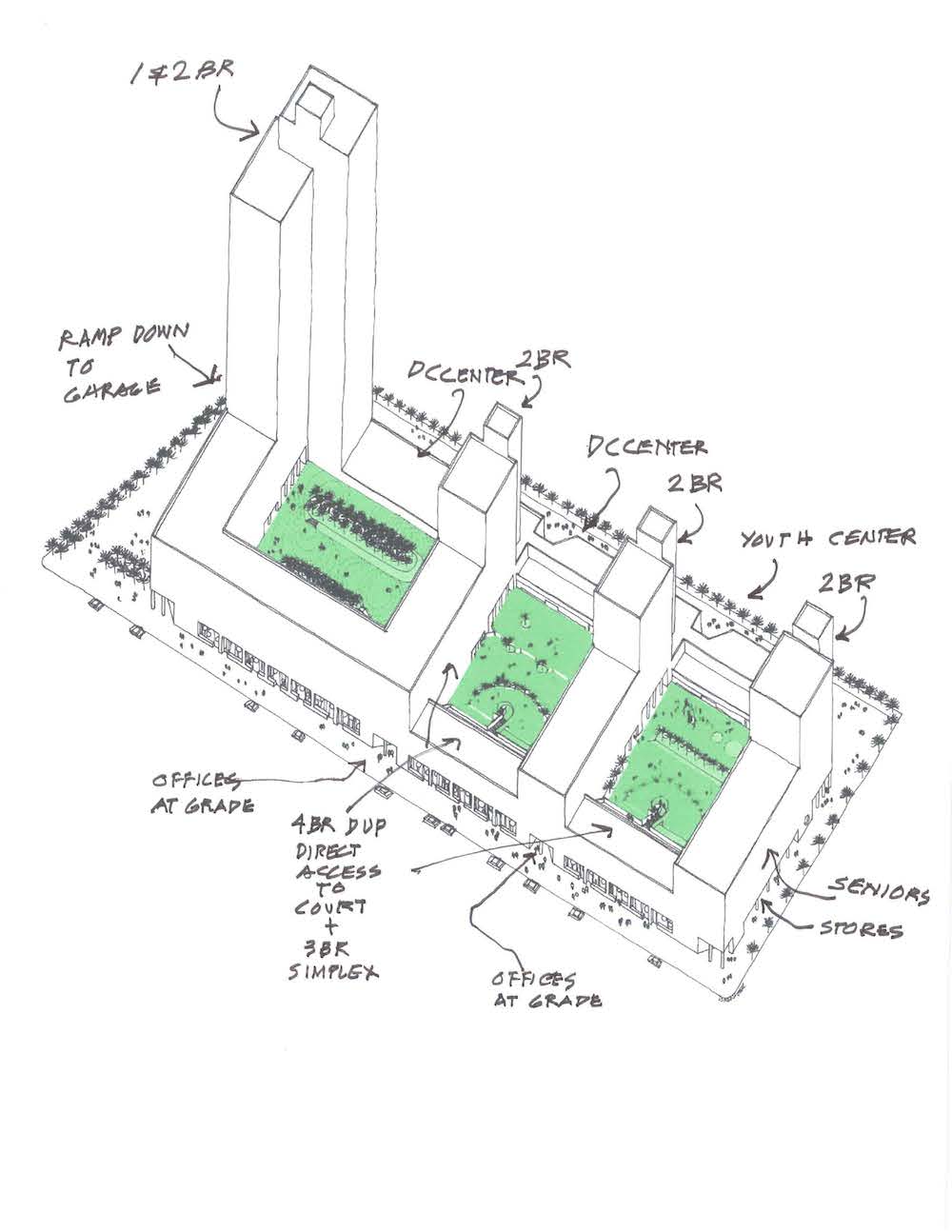
Back to the Bronx. Why review this building now? Because Melrose D-1 sets a standard for housing and urban design that is as relevant today as it was forty years ago. It acknowledges housing as a banal, repetitive, highly cost-driven design problem, and makes a virtue out of it. The complex’s urbanism is not just about the now-standard application of a continuous street wall, but about the sculpting of the overall building mass in a way that makes it legible close up—for instance, a covered sidewalk space at the corner of Morris and 149th allows for gathering—as well as at a distance. The towers beckon from beyond the Harlem River and celebrate the unlikely but generous vistas created by the Metro-North rail line cutting through the otherwise built-up city. Melrose D-1 makes full use of the four streets that frame it: Along 149th Street, commercial storefronts and access to the office spaces behind; from Park and Morris Avenues, the entrances to the sequence of three courtyards, designed by landscape architect Henry Arnold, from which all apartments are accessed; from 150th Street, closed to through traffic at the time, the access to three day-care and community center spaces, day-lit from the courtyards.
The almost 500 apartments provide a broad range of unit sizes and types. A look at plans filed in the Department of Buildings helps to understand how they are organized. The complex breaks down into six separate and unconnected parts. Moving from west to east, those are, in plan, an L consisting of a twenty-three-story high-rise and a six-story mid-rise. Then, separated by the courtyards, there are three I’s each combining a 10-story tower and a mid-rise section. Finally, wedged between the three I’s, along 149th Street, are two bars of duplex apartments. Apartments in the towers and mid-rises are accessed by separate lobbies. The duplexes, intended for larger families, are accessed from open galleries connecting directly via open stairs to the courtyards. One level of independently operated parking for 240 cars, reached from Park Avenue, lies below it all.
Renewal
One could argue that it’s pointless to review this building now; that despite its virtues, this kind of large and contiguous site no longer exists today; that as its original name, D-1, indicates, it was created as part of an urban renewal process that comes with the collateral damage of eminent domain, forced displacement of residents, and destruction of historic smaller-scale buildings. But wouldn’t its block-scaled strategy of composition work equally well for integrating existing fragments into a whole? Isn’t it time we revisit urban renewal, which is far more complex and has yielded much more diverse results than its terrible reputation suggests? Shouldn’t we consider stronger mechanisms of public planning in lieu of piecemeal private real-estate ventures? The recent exhibition “Reviewing Renewal” (organized by the advocacy group 596 Acres at the Queens Museum) and the accompanying website urbanreviewer.org make one thing quite clear: In New York City, urban renewal is not a distant, pre–Jane Jacobs reality, but a current planning and development tool. Urban renewal areas are still being created to encourage investment and cohesive development, but—counter to the evil narrative—their goals can be changed over the course of their active life, which is set by New York City law as forty years. The “Melrose Urban Renewal Area” of which D-1 is a part, expired only in 2010.12 Further north along Morris Avenue—as a part of this same URA—are other accomplishments, variations of full-city-block housing design.13 The comprehensive, larger-scale perspective of which D-1 and its neighbors are a part is important—city building is a permanent work-in-progress, involving new construction, demolition, alteration, and manipulation, invariably implemented by both the public and private sectors. A plan for a last vacant full-block site just north, Site C on the Urban Renewal Plan, broke ground in September 2014. Hopefully the actual building will outperform what the renderings suggest.14
Prettiness
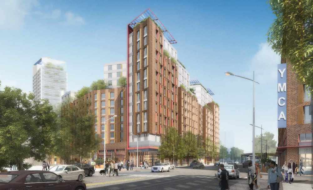
“Bronxchester” is yet another such urban renewal area, located just a few blocks east on 149th Street, expired only on March 31st of this year. The much-heralded Via Verde was built on one of the URA sites, and an RFP for the last large parcels within the URA boundary was issued by Mayor Michael Bloomberg shortly before the end of his tenure. It was won by a group of for-profit and non-profit developers together with several community organizations including the YMCA. The proposal, called “La Central,” will include 965 apartments for low- and moderate-income households. A look at the renderings published to date leaves me wondering: Why the obsession with prettiness in the housing we design today? Why do we need green fuzzies and batteries of blue solar panels on roofs to suggest sustainability? On the northern, triangular site, why cut up the blocks for an appearance of “permeability,” forsaking that these exterior spaces could actually be used? Why the unresolved back-and-forth in the façades, when it leads to no tension or overall composition in the massing? Why the fear of height, leading to its disguise by applying the color white to everything above the ninth floor? Prettiness generally doesn’t age well; sobriety, as D-1 shows, does.
Scale
When I finally met Warren Gran last fall, the half-retired architect made clear that D-1 is one of his favorite works in a career encompassing not only housing but historic preservation, schools, and the teaching of urban design. Asked how he and Irving Weiner had landed the job, he pointed out that in the late 1960s, the New York City Housing Authority—still active in the construction of public housing—and the City Planning Commission were hard-pressed to identify land for new development. They commissioned Weiner & Gran, who had met working for Ed Barnes and started their joint practice in 1966, to study what could be built above this major urban cut between 156th Street and the Cross-Bronx Expressway.15 Weiner & Gran presented a comprehensive proposal for a string of nodes consisting of community facilities, schools, retail, and new and renovated housing, complete with a proposal as to how this would be accomplished structurally. The idea of a “linear center” was reviewed as visionary and pragmatic in the United States and abroad, and the UDC (as well as its chief architect, Ted Liebman) took note. According to Gran, the UDC reached out to the young firm based on this record to look at a block—Melrose D-1—that hadn’t been part of the study but was also located adjacent to the tracks.16 This became a commission. Soon after D-1 was completed, Weiner & Gran’s business declined (as it did for many architecture offices of the period) and they dissolved the office, going on to practice in other partnerships. The only part of the earlier air rights proposal ever to be realized, and only remotely related to what was originally proposed, was the “Morrisania Air Rights” public housing complex, commissioned in 1971, but completed only in 1980 due to funding issues. The three concrete towers make legible their straddling of the rail line rather inelegantly, through concrete fins widening toward the base. The buildings were not much loved then, nor seem to be now. But perceptions change, while the underlying issues remain the same. Scale is one of them. (Mayor de Blasio and team, take note while planning for Sunnyside Yards.)
Now
We need to see, and judge, history as if it were contemporary. After all, we don’t have a choice: The buildings exist and we need them. With very few exceptions, postwar low- or moderate-income housing developments in New York have not been demolished.17 Their potential real-estate values and their social values as rent-regulated housing seem to strike a balance. The preservation of their physical structures appears, at least on the surface, to go hand-in-hand with the preservation of their affordability structures. That might be the pragmatic takeaway of this belated review of Melrose D-1: The building seemed to work then, and it seems to work now.18 The discursive takeaway: We need to review not only the buildings we like, but those we don’t (although I admit to reviewing this one because I think it’s exceptional). We need to show not only the striking view, but the back alleys and overall floor plans as evidence. We need to write not only about what is new when it is new, but many years later—as if it were new still.
-
Via Verde is a 222-unit mixed-use, mixed-income affordable housing development by Phipps Rose Grimshaw Dattner in the Bronx completed in 2012. It has become a key reference for better architecture in housing, but has also been widely criticized for above-average cost. ↩
-
Robert Stern, Tom Mellins, and David Fishman, New York 1960 (New York: Monacelli, 1995). ↩
-
Richard Plunz, A History of Housing in New York City (New York: Columbia Universtiy Press, 1990). ↩
-
Avery Index to Architectural Periodicals, New York: Columbia University, available on ProQuest. ↩
-
Elliot Willensky and Norval White, AIA Guide to New York City, Third Edition (San Diego: Harcourt Brace & Company, 1988), 489. ↩
-
Kenneth Frampton, “Twin Parks as Typology," Architectural Forum, no. 5 vol. 138 (June 1973): 55–61; Suzanne Stephens, “Learning from Twin Parks,” Architectural Forum, no. 5 vol. 138 (June 1973): 62–67; Manfredo Tafuri and Francesco DalCo, Modern Architecture (New York: Abrams, 1979), 310; Stuart Cohen, “Physical Context/Human Context: Including It All,” Oppositions no. 2 (January 1974): 1–40; Marie-Christine Gagneux, “Derrière le miroir,” Architecture d’aujourd’hui no.186 (1976): 2–14; “Twin Parks East, Bronx” and “Twin Parks West, Bronx,” a+u: Architecture and Urbanism no. 4 vol. 7 (1974): 52–70. ↩
-
For instance, the exhibition “Low-Rise, High-Density,” curated by Karen Kubey, at the Center for Architecture, New York, June 2013. For a longer history of its discourse, see Kim Förster, “The Housing Prototype of the Institute of Architecture and Urban Studies.” Candide: Journal for Architectural Knowledge No. 5 (2012): 57–92. ↩
-
On Marcus Garvey, see Ginia Bellafante, “A Housing Solution Gone Awry,” New York Times, June 1, 2013; on Twin Parks, see Seth Kugel, “Playing in the Hallway, Honey? Don’t Forget a Coat,” New York Times, December 1, 2002. ↩
-
This directly references “House Housing: An Untimely History of Architecture and Real Estate,” the multi-year research project under way at Columbia’s Buell Center for the Study of American Architecture, directed by Reinhold Martin, exhibitions co-curated by Jacob Moore and me. For more information see house-housing.com. ↩
-
Charles Hoyt, “What did the new super-agency mean for the architect?” Architectural Record (October 1975): 107–110. ↩
-
Werner Blaser, Ludwig Mies van der Rohe (Barcelona: Gustavo Gili, 1994); Jean-Louis Cohen, Mies van der Rohe (Paris: Hazan, 1994); Phyllis Lambert, ed. Mies in America (New York: Abrams, 2001). ↩
-
This differs from the date on urbanreviewer.org (2017), and was confirmed by Ted Weinstein, director of planning for the Bronx at the New York City Department of Housing and Urban Development. ↩
-
Most significant is John Ciardullo’s Maria Lopez Apartments, completed in 1982, an Aldo Rossi-esque perimeter block whose lower two floors are made up of townhouses directly accessed from the street, framing a large inner courtyard for residents only. ↩
-
Stephen Smith, “Revealed: 655 Morris Avenue, South Bronx,” New York YIMBY, October 14, 2014, newyorkyimby.com/2014/10/revealed-655-morris-avenue-south-bronx.html. ↩
-
Edward Larrabee Barnes (1915–2004), a Harvard-educated architect, is best known for his museums, high-rise office buildings, and university buildings. ↩
-
Donald David Logan, “Weiner and Gran: A Brilliant Design for the Bronx,” Architectural Record (September 1970): 129–136; “Lineares Zentrum für Bronx,” Baumeister (June 1971): 647-653. ↩
-
One exception to the rule is the proposed plan for redevelopment of the Lambert Houses, a contemporary of Melrose D-1, located in the Westfarms neighborhood of the Bronx. See my recent piece “The Bronx’s Lambert Houses and the Two Sides of Preservation,” in Urban Omnibus: urbanomnibus.net/2015/04/the-bronxs-lambert-houses-and-the-two-sides-of-preservation. ↩
-
This is my impression based on two site visits of the building exterior and courtyards, as well as the interviews with Warren Gran and Wilhelm Ronda. BSR, the owners and managers, were not interested in speaking with me. I did not speak to residents or anyone who could explain to me the precise role of state and federal subsidies in securing the low- and moderate-income housing. ↩
Susanne Schindler is an architect and writer focused on the intersection of policy and design in housing. She is lead researcher of “House, Housing: An Untimely History of Architecture and Real Estate” at Columbia’s Buell Center for the Study of American Architecture and teaches design at GSAPP.

